Vespa Adverts
This was a university advertising campaign for Vespa. The intention was to promote product visibility and design additional accessories.
In the Vespa project, the graphics class was instructed to redesign the Vespa. This involoved recolouring and redesigning the scooter, the helmet, and adding on extra accessories to promote the advertising of the Vespa scooter.
Design Rationale
I decided to focus on two main elements regarding the design. This was through the use of bright colours and adopting styles from a bird. The purpose was to reflect upon the desires from my three personas, being a link from Vespa’s demographic. With the demographic being focused on the age group 25-45, their passion is closely linked towards a contemporary art and design culture. Therefore, to respond to this trend, the idea of containing bright colours and the aesthetic of the bird would inspire and innovate to construct a new product. To regard visibility, containing the colours of red, yellow and orange envisions a feel of energy. From this, the design would be best suited to be gazed upon bystanders as an aesthetically pleasing Avant-Garde and another unique product embedded within the growing trends in the contemporary culture. (make paragraph).
I decided to focus on two main elements regarding the design. This was through the use of bright colours and adopting styles from a bird. The purpose was to reflect upon the desires from my three personas, being a link from Vespa’s demographic. With the demographic being focused on the age group 25-45, their passion is closely linked towards a contemporary art and design culture. Therefore, to respond to this trend, the idea of containing bright colours and the aesthetic of the bird would inspire and innovate to construct a new product. To regard visibility, containing the colours of red, yellow and orange envisions a feel of energy. From this, the design would be best suited to be gazed upon bystanders as an aesthetically pleasing Avant-Garde and another unique product embedded within the growing trends in the contemporary culture. (make paragraph).
-Design Concept
I too wanted to envision and design a product, however take a more unique turn to push the design to stand out differently and henceforth be easily distinguishable upon different products.
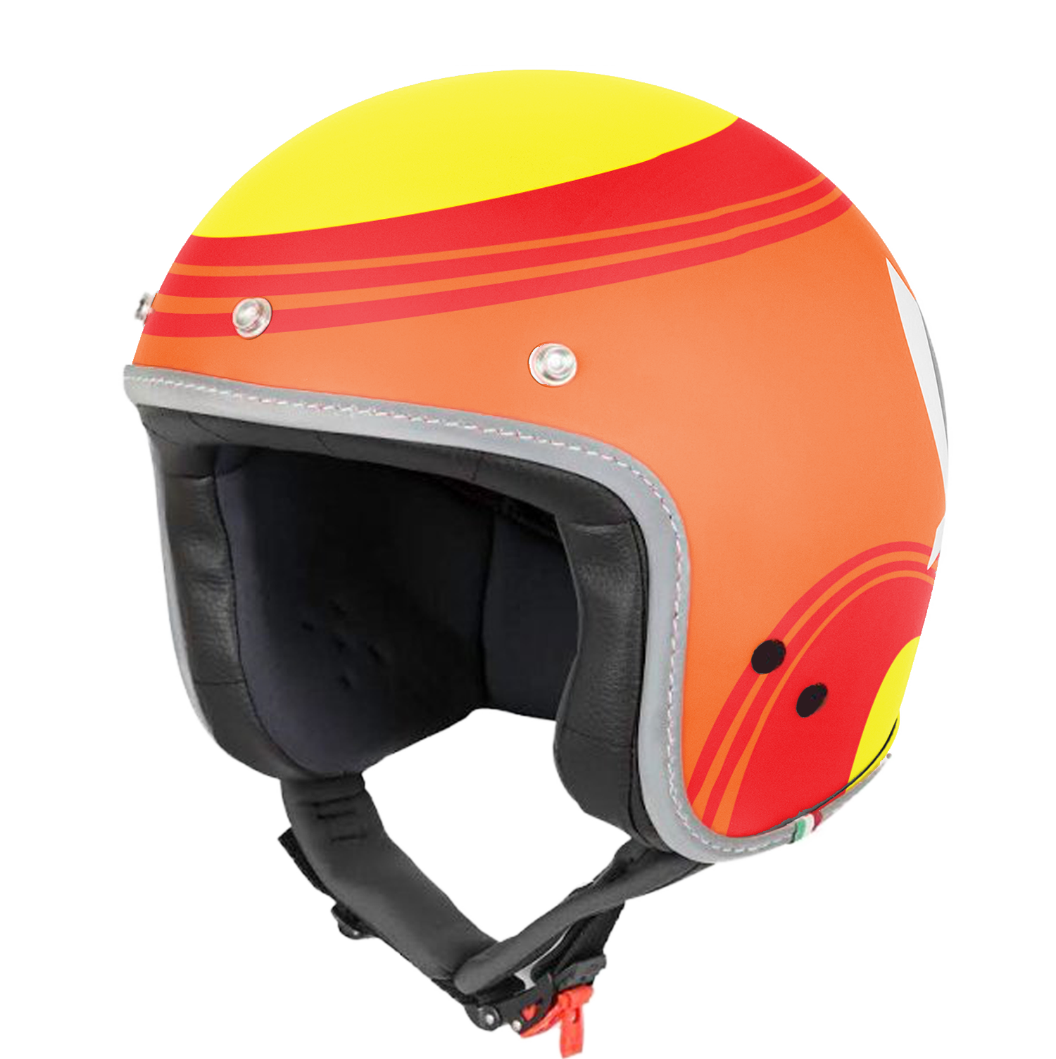
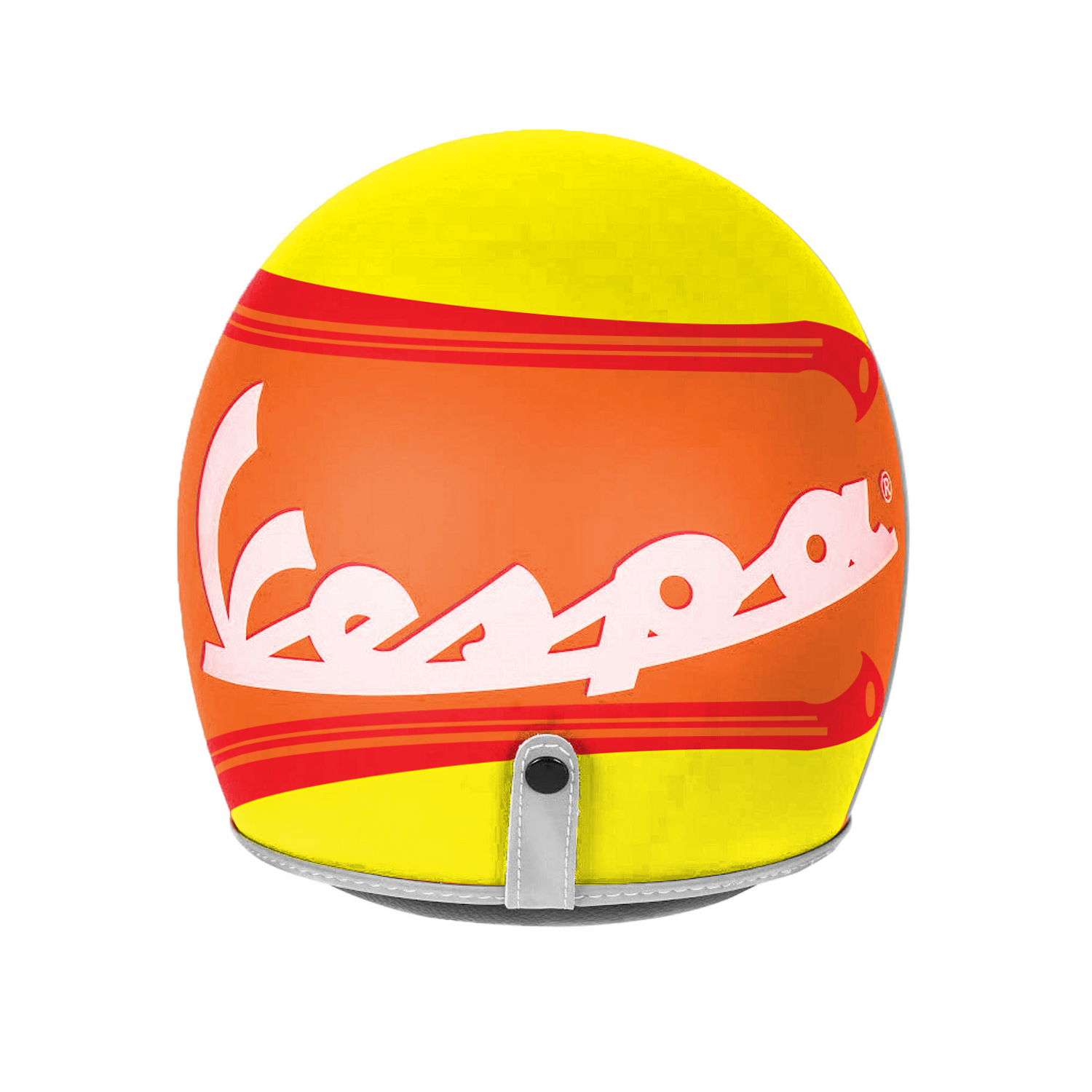
For this project, driven with a fierce pride to promote visibility, I re-designed the colour of a Vespa scooter with the intentional colours popular for visibility. The helmet (next page) contains a similar path with a matching style to connect the scooter as one whole work to promote my campaign of the Vespa being more visible. To continue the visibility promotion, I’ll also created two accessories, a t-shirt and key-ring.
These designs were inspired by Australia’s culture containing the environmental elements of the landscape, and the personality of the progressing contemporary culture being within the heart of the demographic of an ideal Vespa user. The bird as an aesthetic and combined with warm, engaging colours correlates a sense and vision upon Vespa’s audience.
I too wanted to envision and design a product, however take a more unique turn to push the design to stand out differently and henceforth be easily distinguishable upon different products.
For this project, driven with a fierce pride to promote visibility, I re-designed the colour of a Vespa scooter with the intentional colours popular for visibility. The helmet (next page) contains a similar path with a matching style to connect the scooter as one whole work to promote my campaign of the Vespa being more visible. To continue the visibility promotion, I’ll also created two accessories, a t-shirt and key-ring.
These designs were inspired by Australia’s culture containing the environmental elements of the landscape, and the personality of the progressing contemporary culture being within the heart of the demographic of an ideal Vespa user. The bird as an aesthetic and combined with warm, engaging colours correlates a sense and vision upon Vespa’s audience.
Marketing campaigns
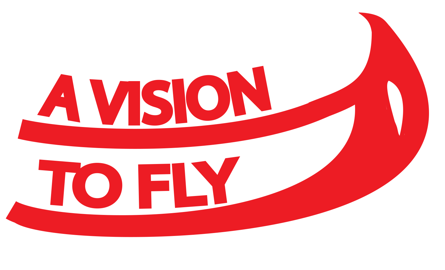
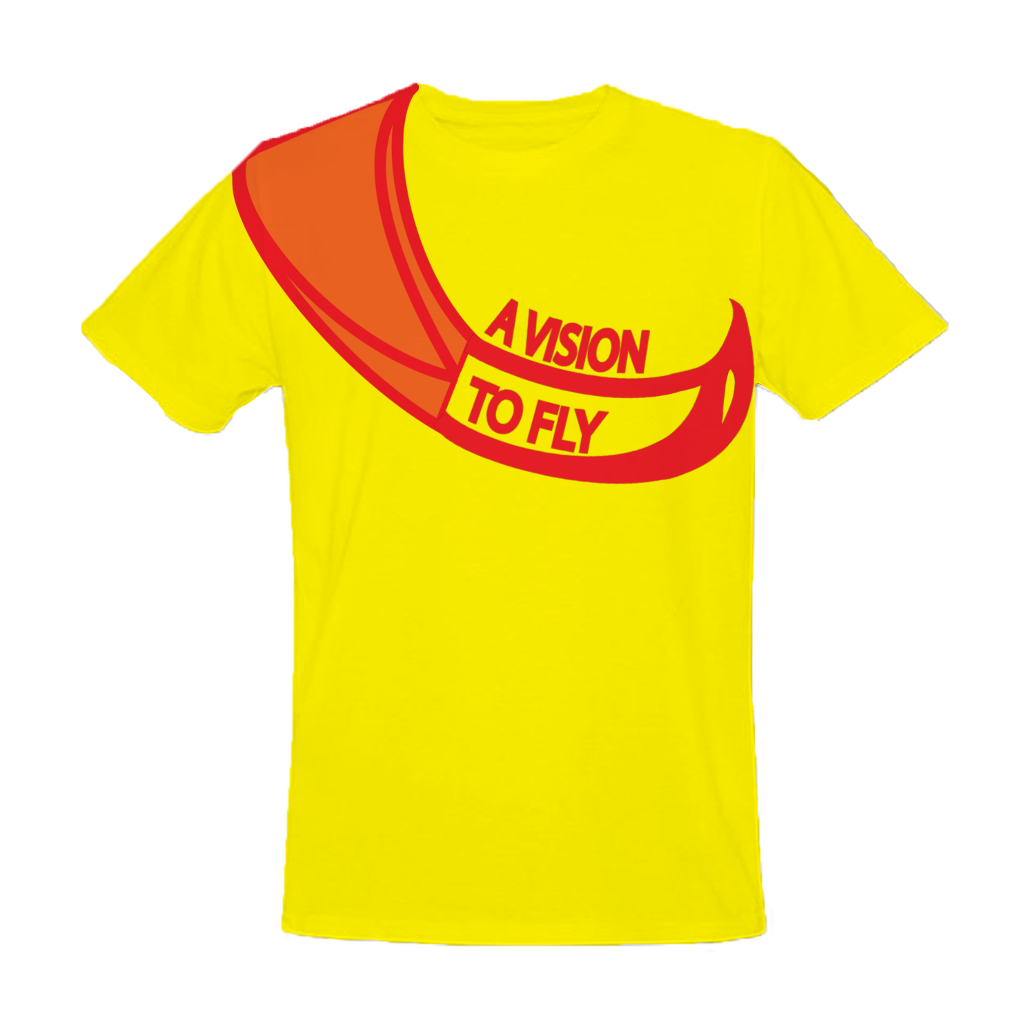
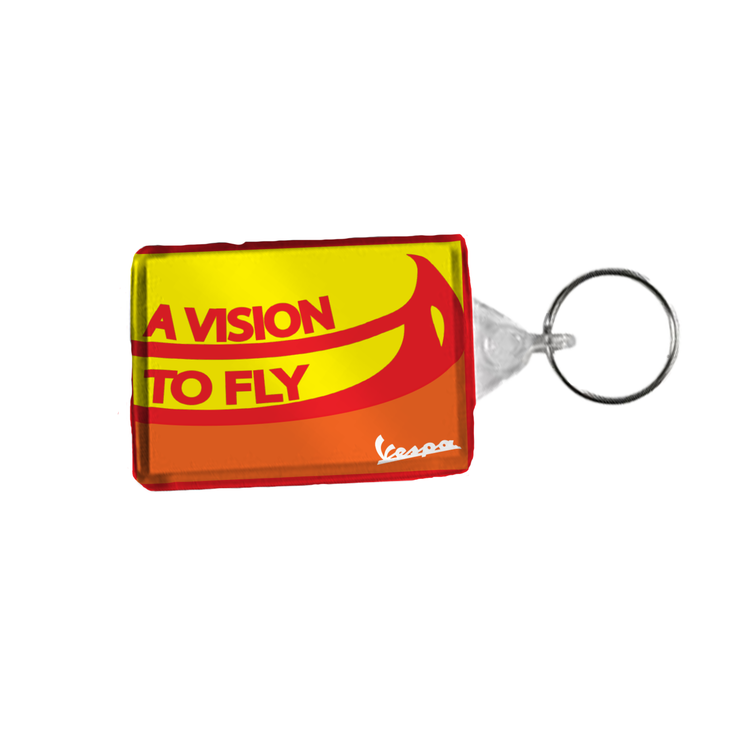
The main goal of marketing a product is to keep it clear, simple and easy to read. In doing so, I made an intentionally simple and clear presentation of the Vespa scooter. One strategy I decided to embark on is making a logo to help communicate the idea of the Vespa regarding visibility. “ A Vision to Fly”, which helps my inspiration of the bird to ‘fly’- being an enjoyable ride on the scooter while driving . The use of “vision” helps to express my intention of promoting visibility.
The layout of these campaigns presents the idea of Vespa being easy on and an ideal luxury for use. While it considered expensive, it is relatively affordable and easy to attain from the market.
I choose Facebook as my target demographic as it encompasses an outstanding 2.19 billion users, and unlike other social media sites, it maintains a larger audience in Vespa’s most common age demographic.
Graphic Elements
For my associated graphic elements of the Vespa, I wanted to keep it coherent with my other designs and follow up the energetic feel and engaging ‘fly’ of a ride through urban areas and around Australia.
In my opinion, the consistency of the simple, yet brightly colourful redesigning of the Vespa adds towards not only the intentional promotion of visibility, but in particular, a technological push into the design of multi-coloured aesthetic contained with behavioural bird adaption’s for the pleasure of riding the Vespa.
Accessories
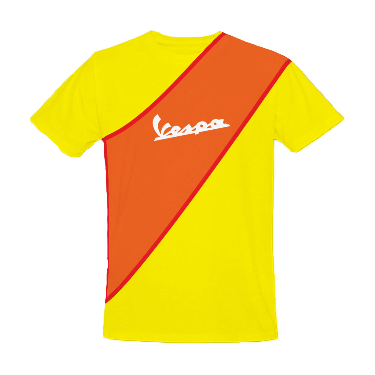
For my other accessories, I wanted to choose products suiting both genders. On top of this, I wanted this is to be a fashion outside the driving session. To help emphasises my campaign of visibility, I choose not only one but two accessories and designed the graphic upon everyday products. For anyone who meets another person, their shirt will be always being the most revealing given its location being on the torso of the person. As Vespa scooters are only restricted to roads, and certain footpaths and so forth, the T-shirt can be worn anywhere at any time. Containing the Vespa logo on the centre of shirt and maintaining a colour which deeply contrasts the surrounding orange, promotes the visibility of the logo.
The key ring is deep as product of uniqueness being in the Vespa community. The colours again also promote its visibility.
The key ring is deep as product of uniqueness being in the Vespa community. The colours again also promote its visibility.
Helmet Design
The design that I chose for accessories and the scooters coloured body is inspired by a flight of a bird merged with the warm yet bright colours. The intention: for a smooth and outgoing ride , is to promote the authentic culture of the Vespa whilst maintaining the necessity to commuting from A to B.
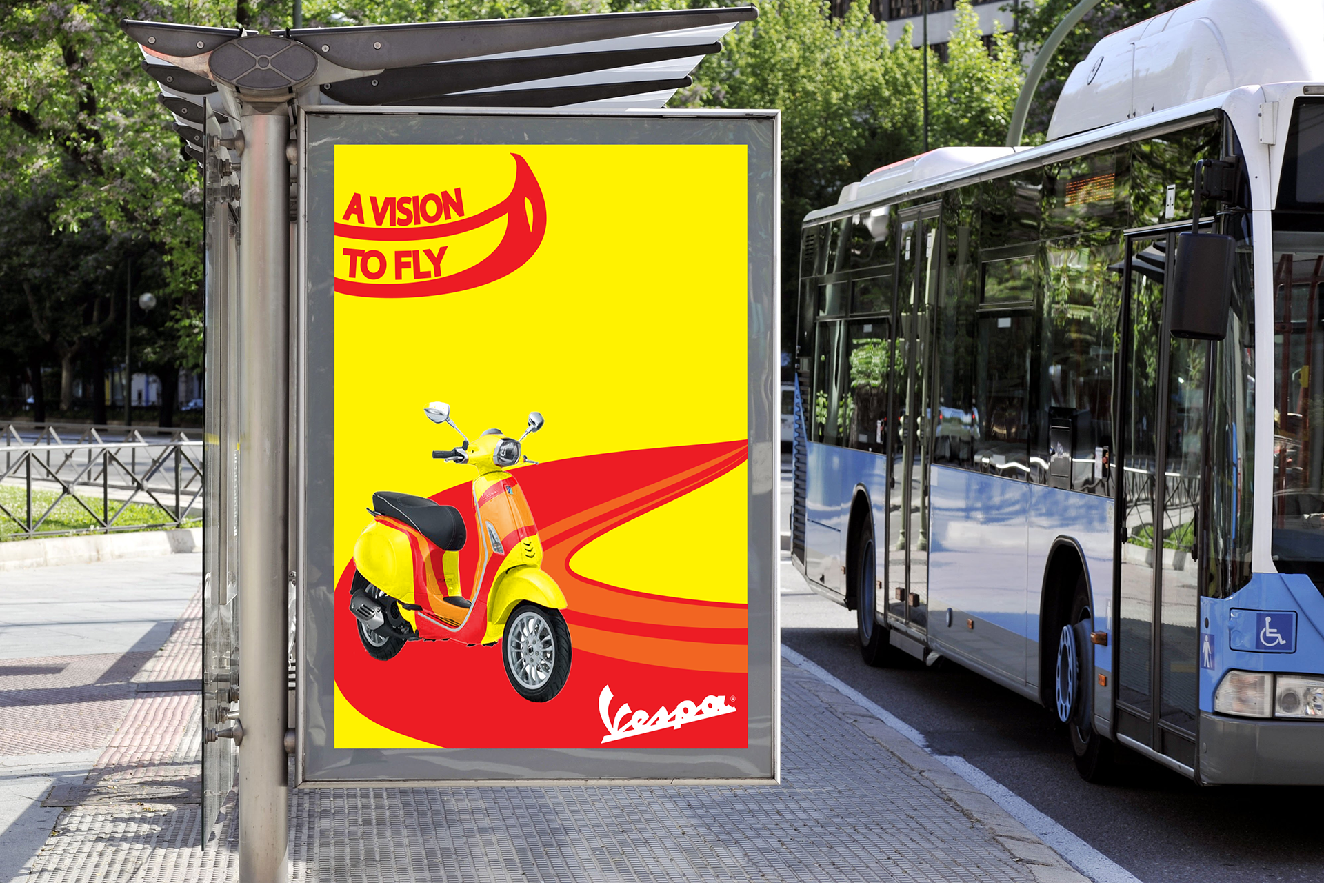
Bus advert
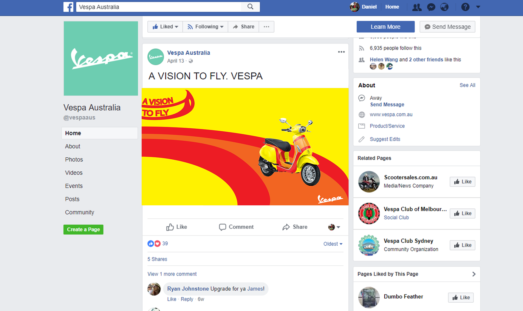
Social Media page
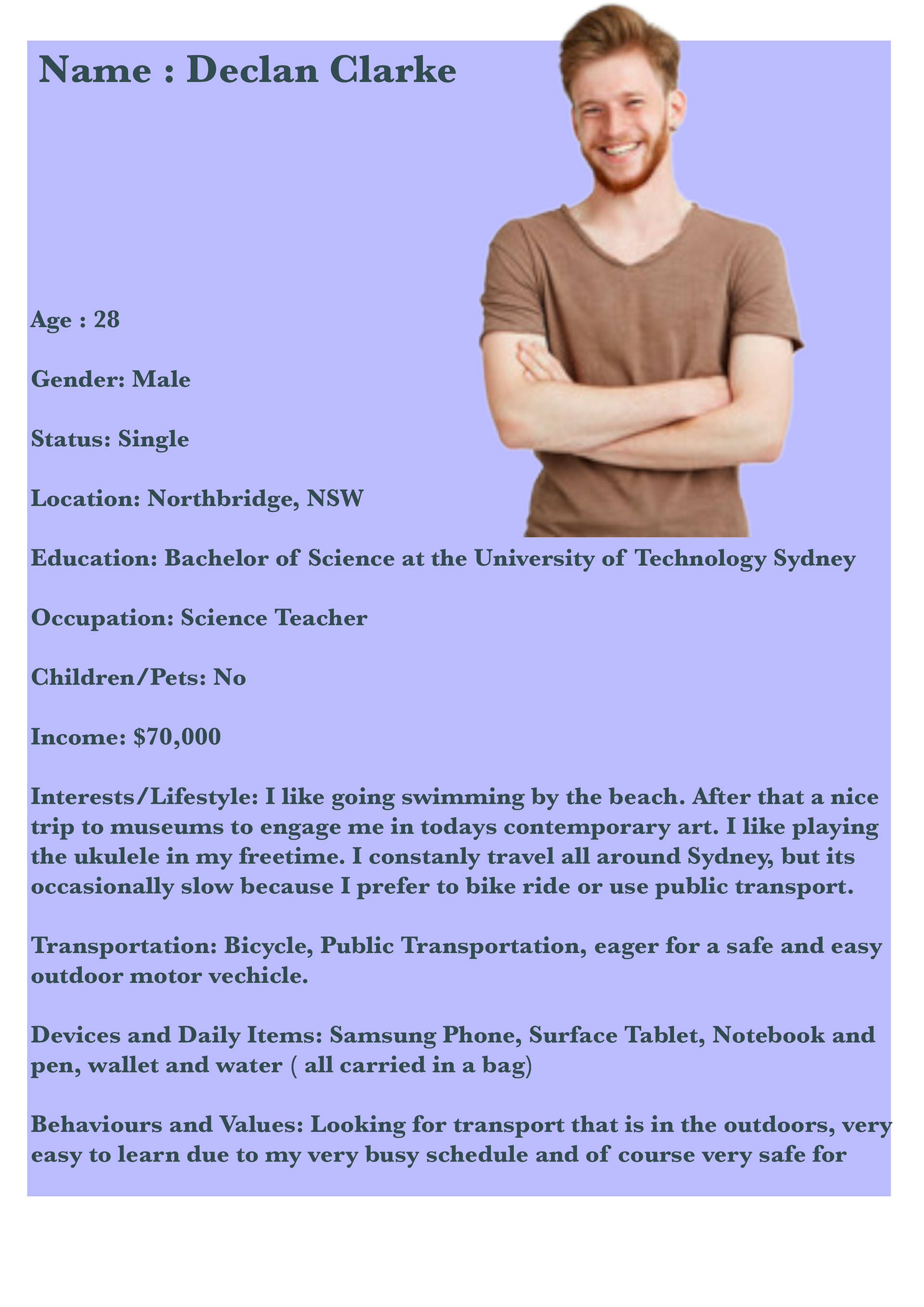
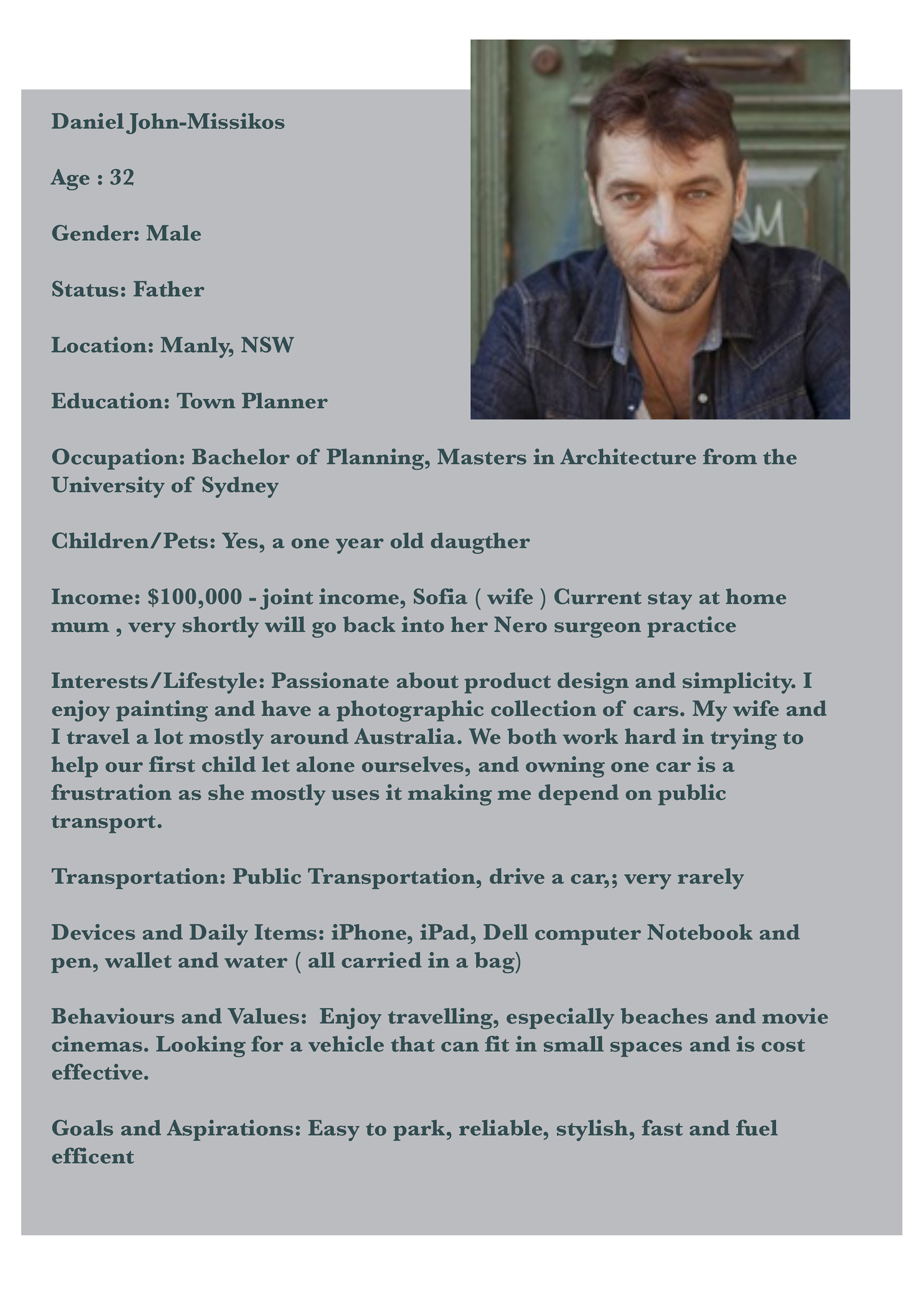
Personas- After researching the target market for Vespa scooters, I designed 3 personas with needs and how this Vespa can meet their criteria.

Helmet Designs
T-Shirt Designs
Key-Ring Design
More details on the miscellaneous Vespa product design on Miscellaneous page