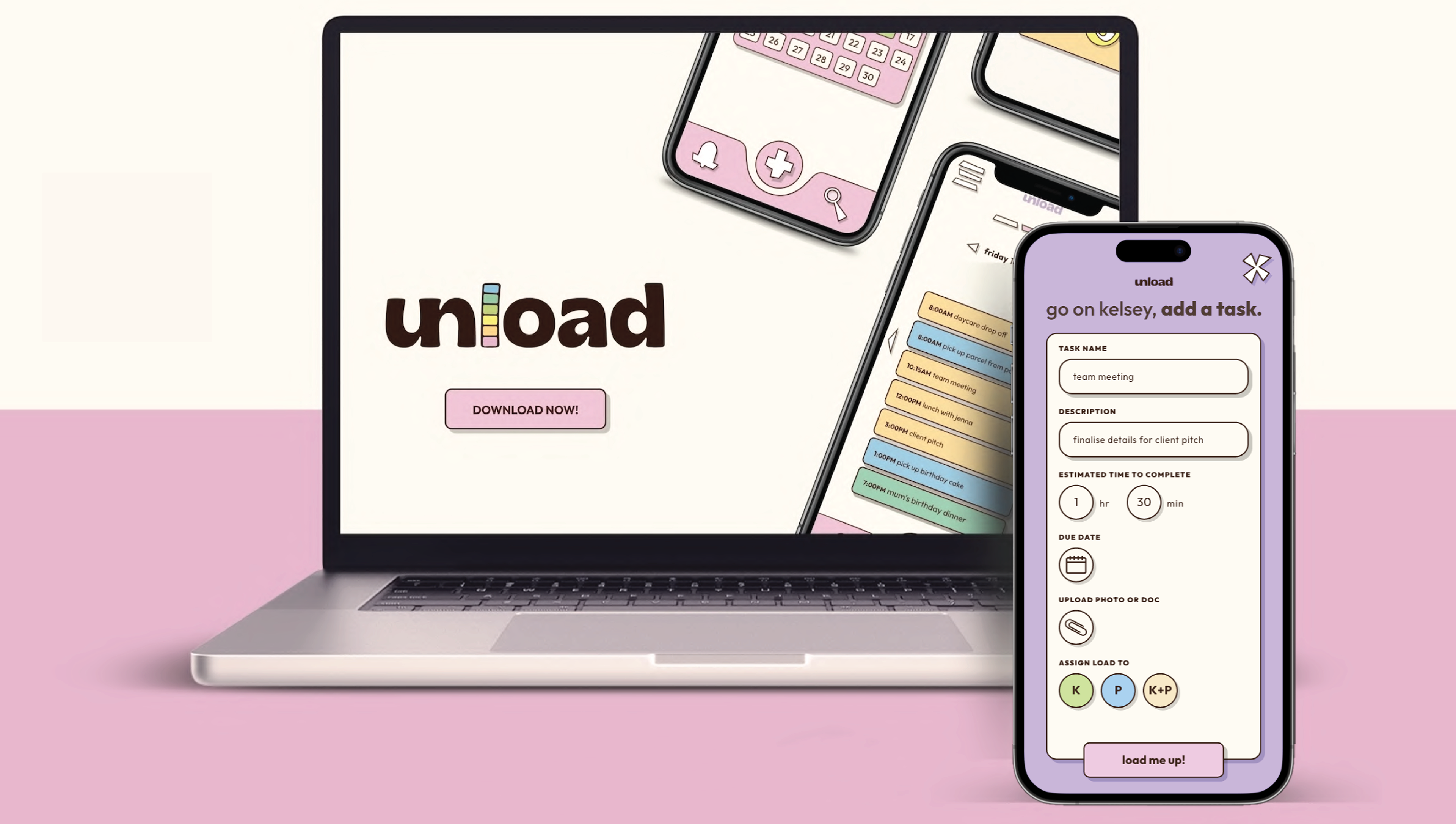
At unload we believe that you possess the potential to make the most out of your day. We will assist you in examining your time and performance so that, together, we can generate new support systems that enhance collaboration and efficiency. Our goal is to help you perform at the highest level through collaboration while recharging your mental batteries.
Research & Planning
To get started we had to research and collect data to identify the user problem. With an abundance of organization apps we had to seek the audience needs to develop a persona.
We broke it down with the direction of our app:
Stress, organisation, communication, responsibility and optimisation were our key findings and potential niche of our product.
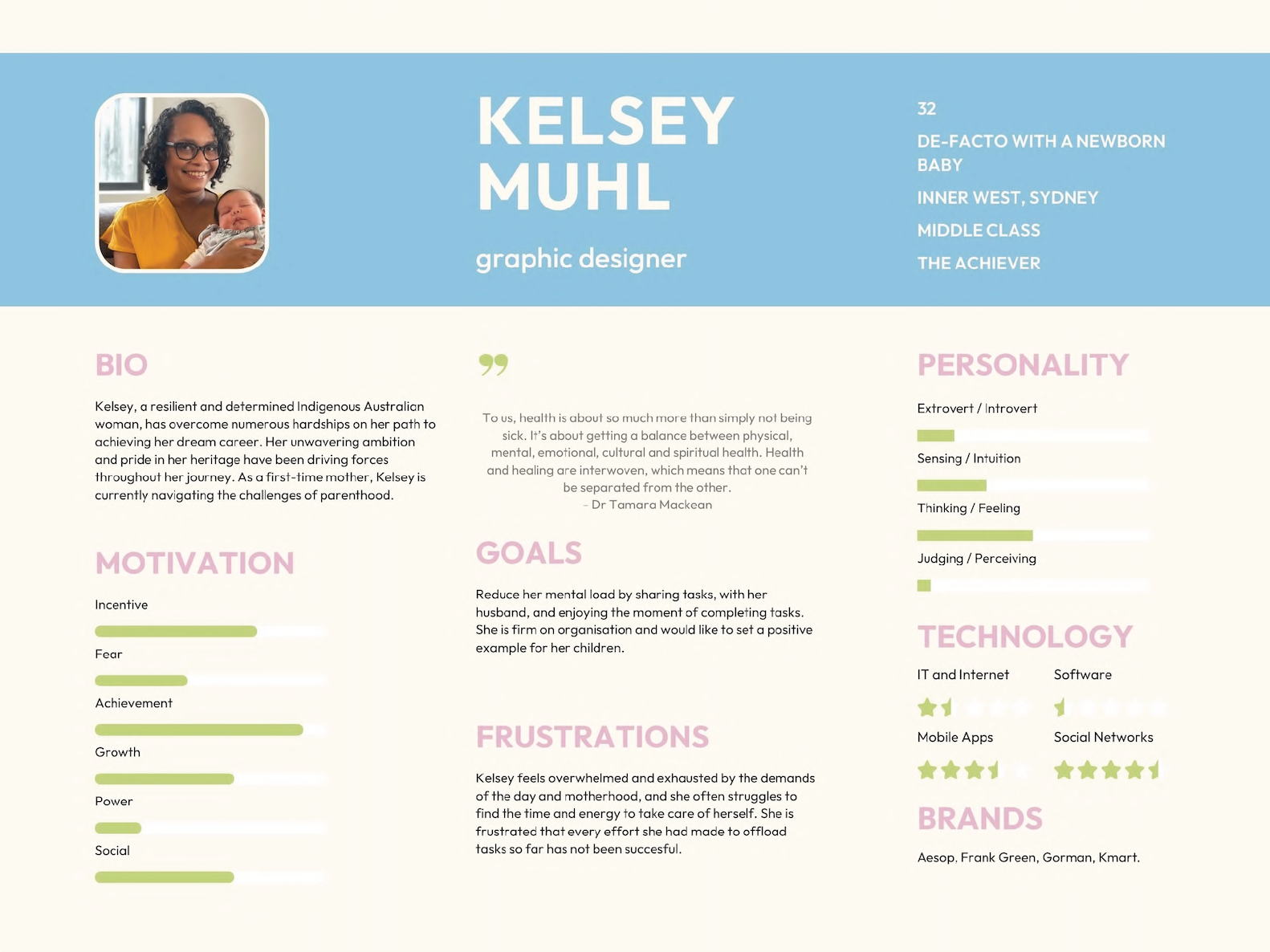
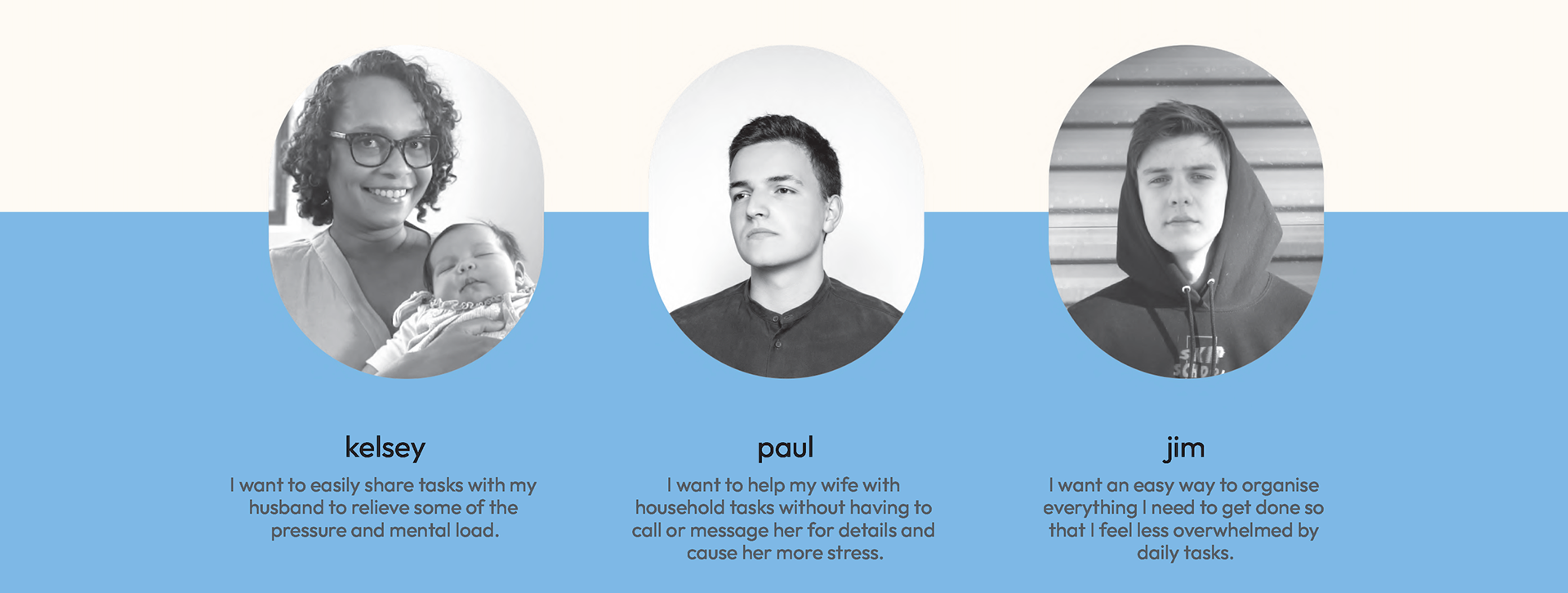
These individuals showcase different needs and scenarios where our app; Unload provided an opportunity to make a difference.
We tried to evade falling into the "just another organisation app", to instead showcase the organisation in the form of sharing with other users.
Storyboard
To gain more data on the persona, we constructed storyboard to draw up a possible real life scanario of everyday situations where Unload can operate.
Take note of the example below:
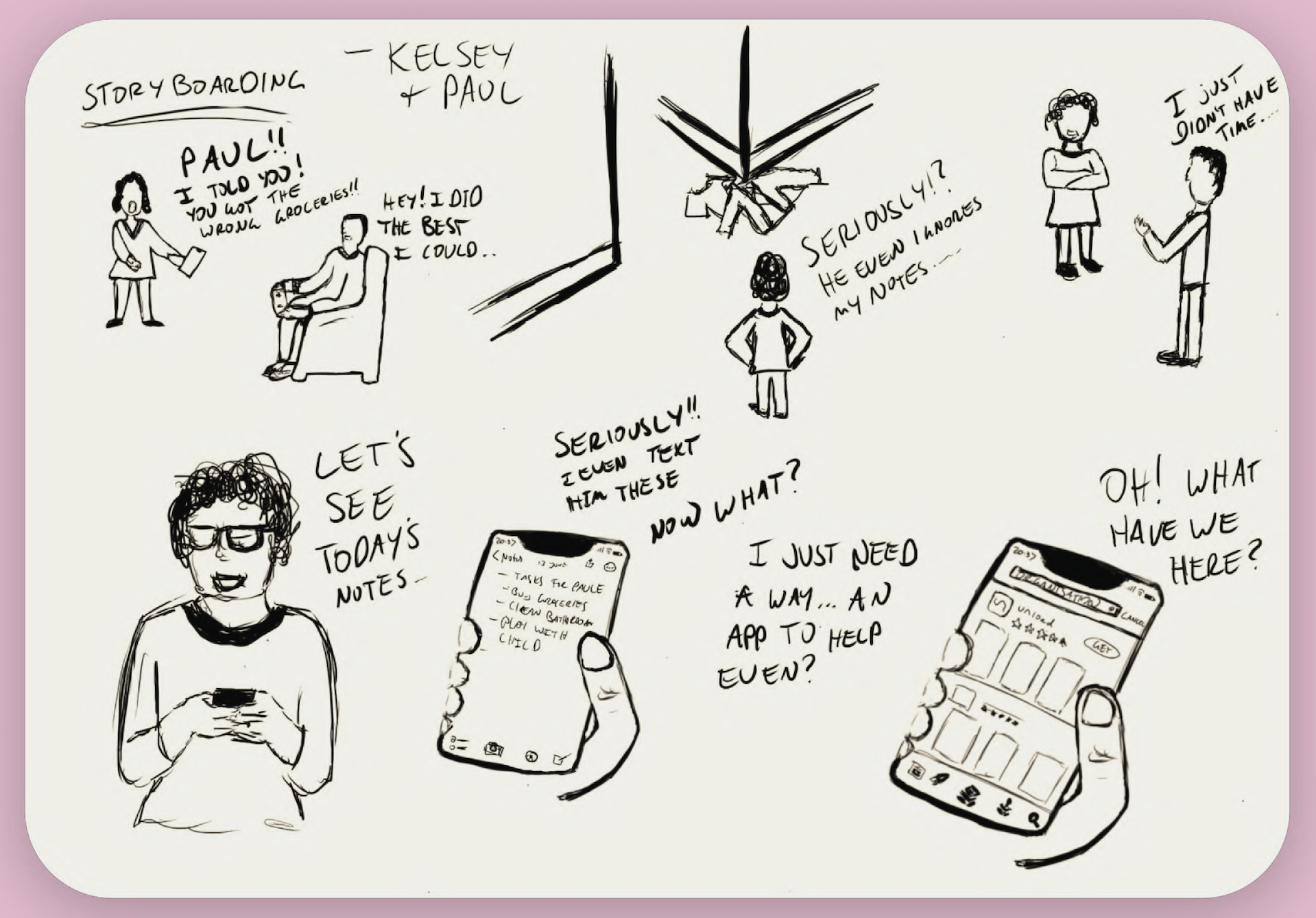
Kelsey and Paul are in their living room.
Kelsey reprimands Paul for bringing the wrong groceries but Paul feels like he did his best with the limited information he had.
Kelsey is frustrated because she sent him notes and instructions for the task that were largely ignored or lost in a sea of other responsibilities.
Paul decides that he needs to look for a solution.
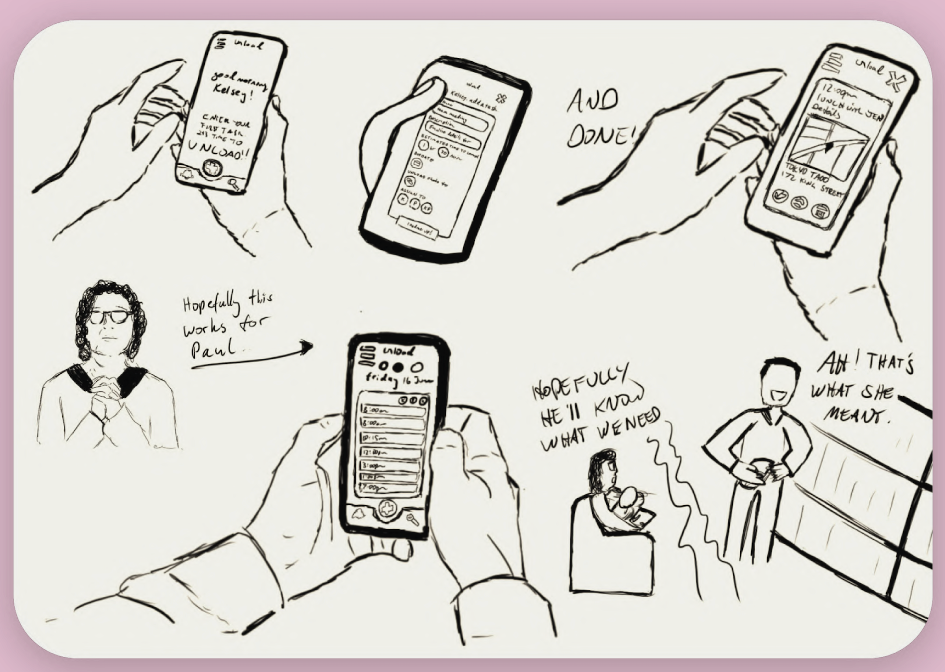
Paul find a new app called Unload. He downloaded and installs it in both of their phones.
Kelsey can now assign clear instructions per task and she hopes this will reduce miscommunication.
Paul is now equipped to handle the task with ease.
He brings home the correct groceries and Kelsey has more time to spend with her baby instead of guiding Paul.
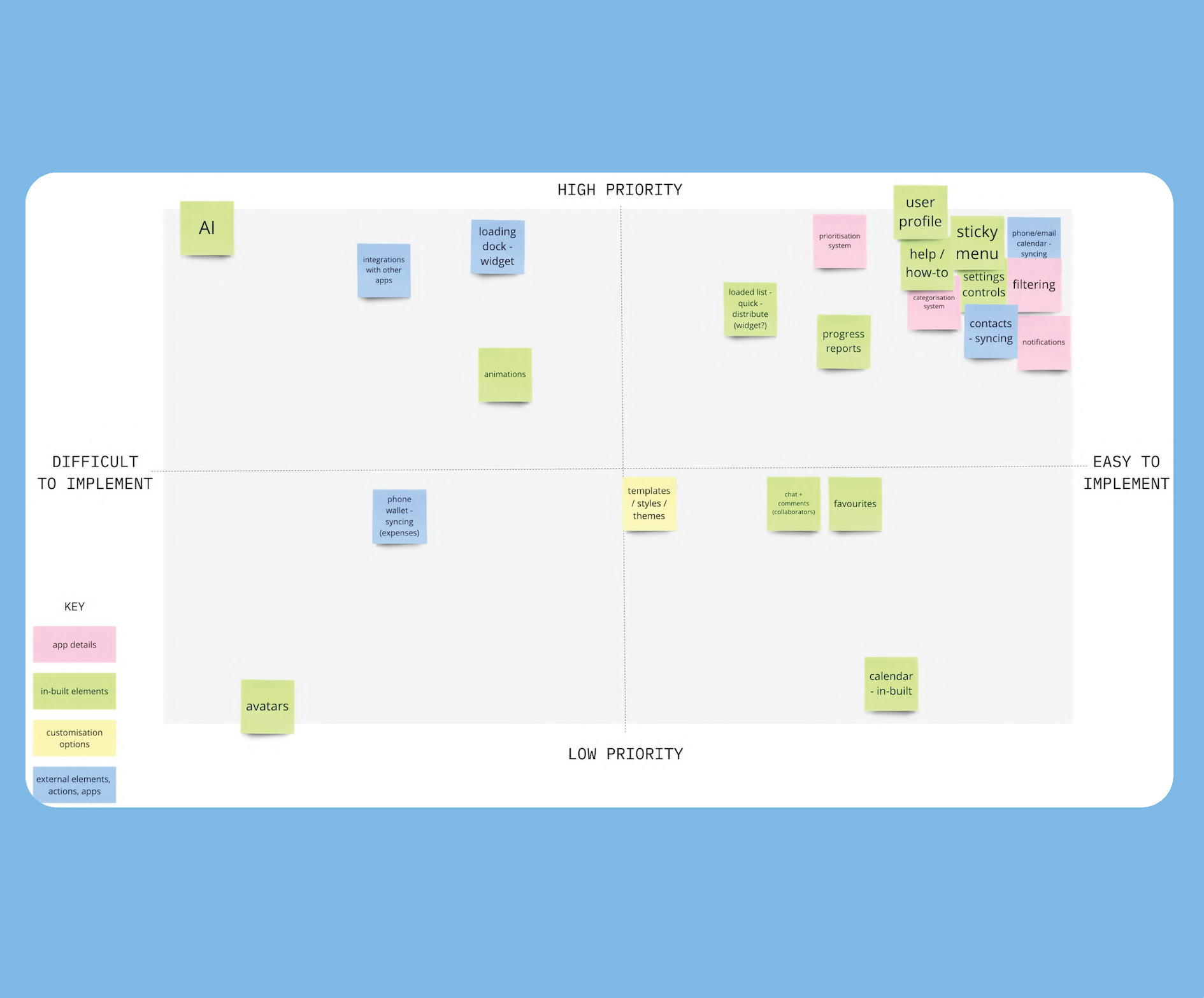
Prioritisation Matrix
+ Key Features
+ Key Features
Key Features
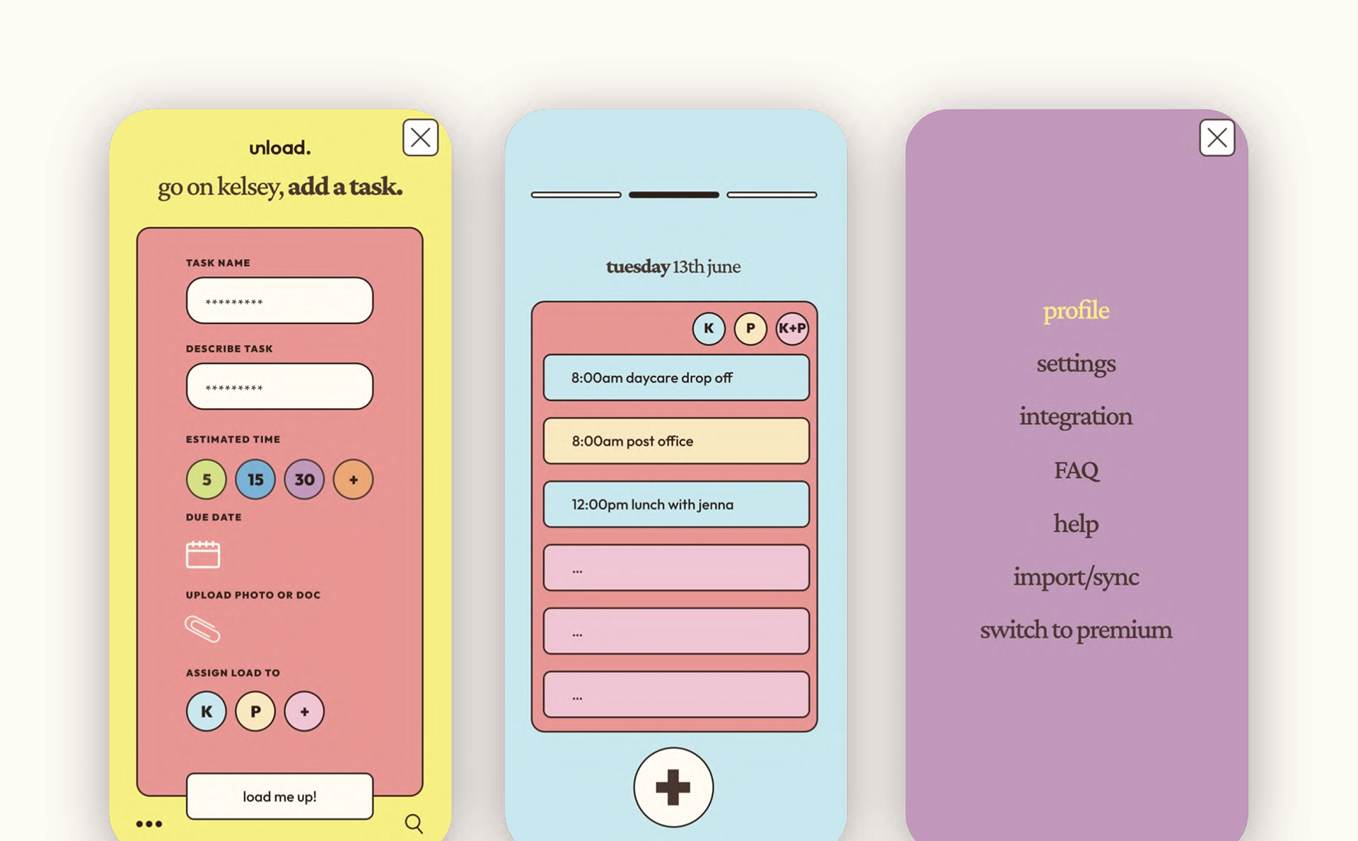
Loaded List
Progress Reports
Filter / Category System
Phone, Email and Calendar
Integration
Notifications
Loaded List
Progress Reports
Filter / Category System
Phone, Email and Calendar
Integration
Notifications
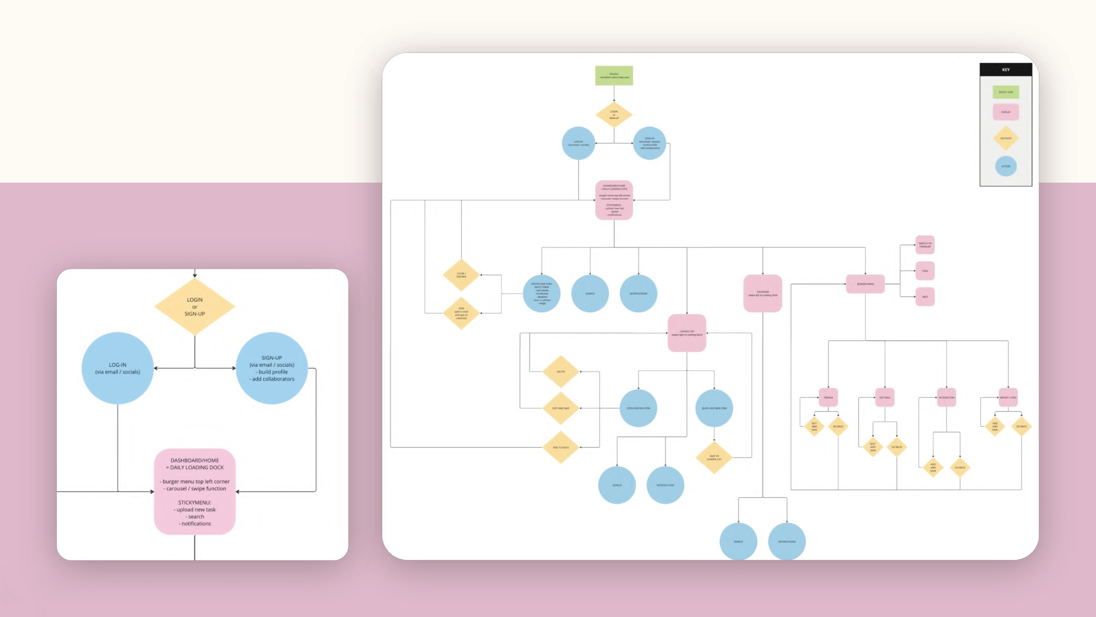
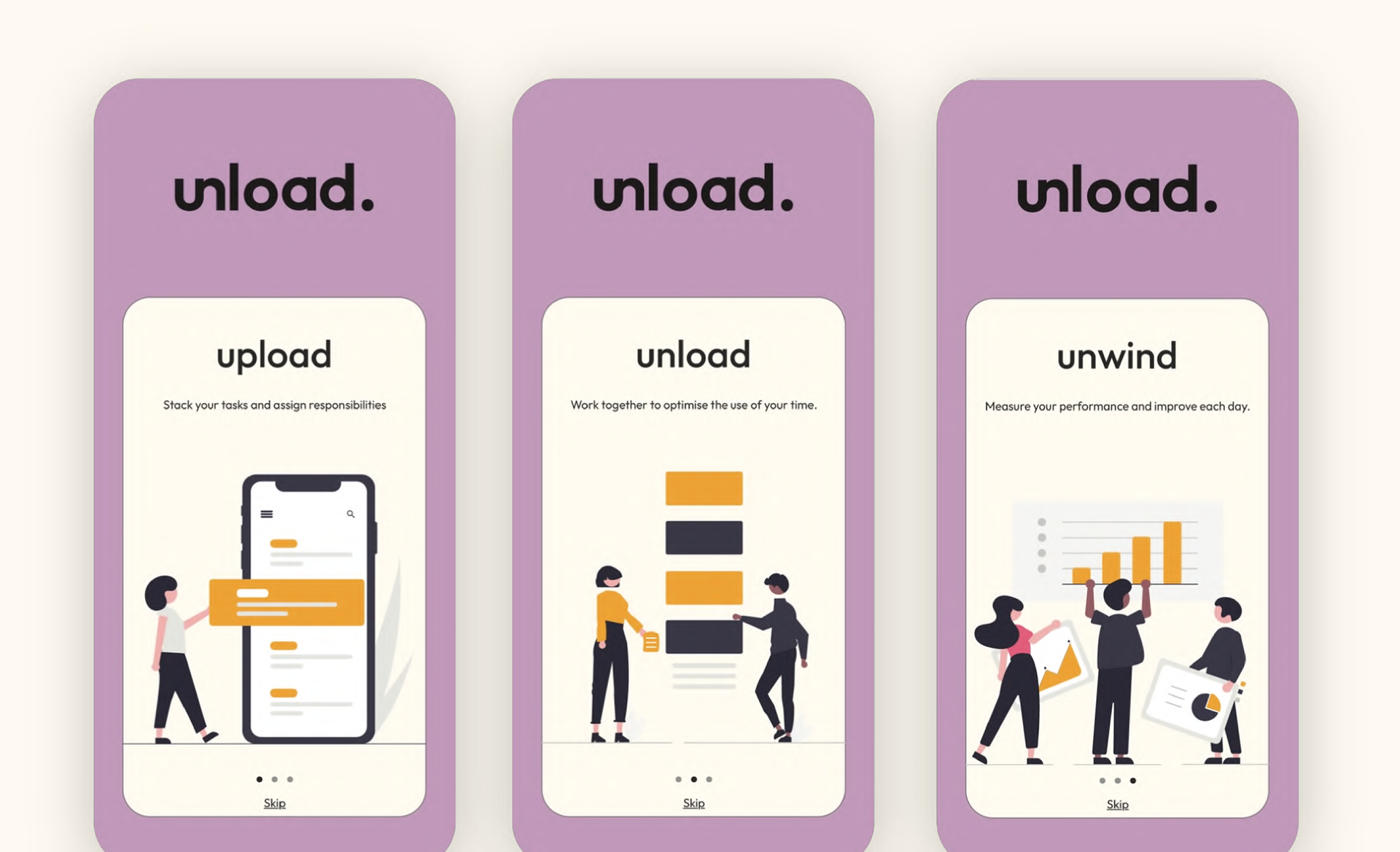
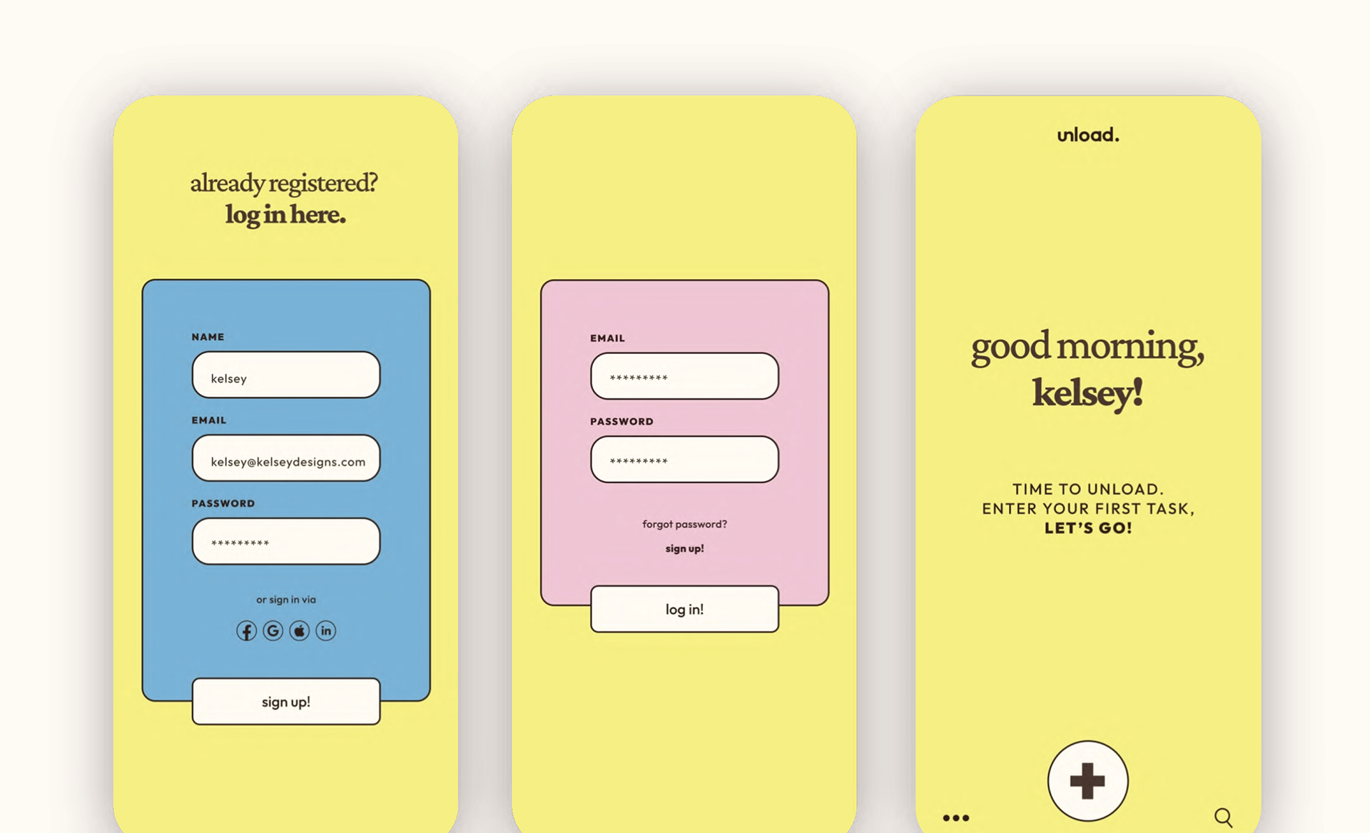
User Flow
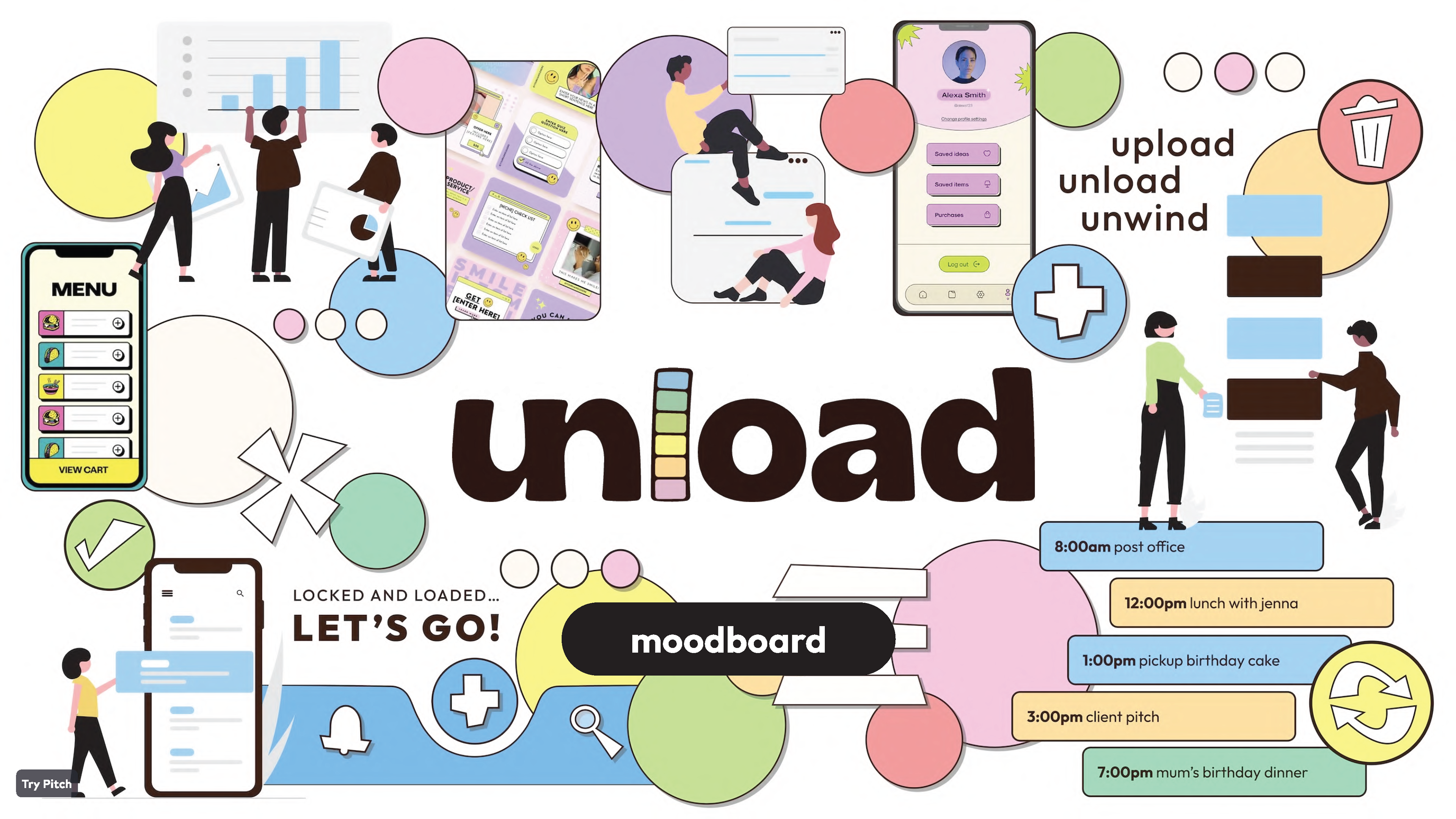
Moodboard
Bringing design ideas together!
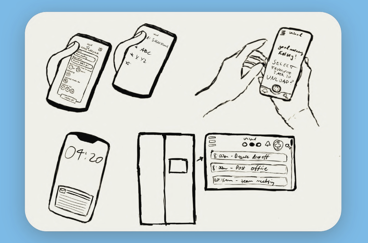
Paper Prototype
We started sketching out the paper prototypes to establish a functioning prototype for our user testing.
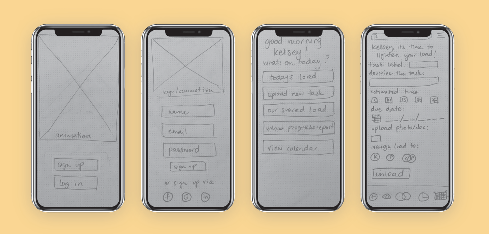
Key Learnings:
Maintain a clean and simple aesthetic positive response.
Adjust and rearranged content on some pages that were a little tight.
Make login vs sign up options more visible - users may want to use
their socials to sign up/log in as it is faster.
Added menu bar to more pages so that users can navigate to
different areas of the app easily.
Added button to help user return home/go back to dashboard more
easily.
Low Fidelity Wireframes
Created on Adobe XD
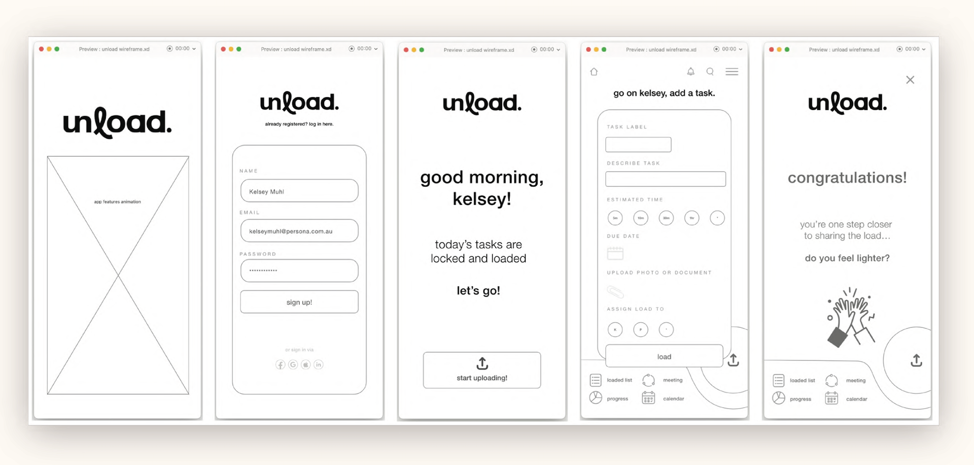
Key Learnings
Overall positive response to the minimal and simple aesthetic, so we have retained this. Added animation to the splash, rather than just a simple logo.
Introduce the user to what the app is for and about.
Added a logo at the top to take the user back home.
Hierarchy enhanced to distinguish between pages and priorities, to
direct the user's eye. Text and copy edited so that it does not blend
together as much, more visual hierarchy.
Adjusted usability of the close button, a larger area to press, easier to use.
Revised introductory page: separated user flow based on first-time
user who has just signed up vs. existing user who has just logged in.
Mini Styleguide
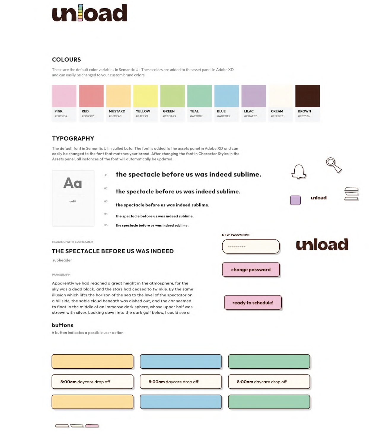
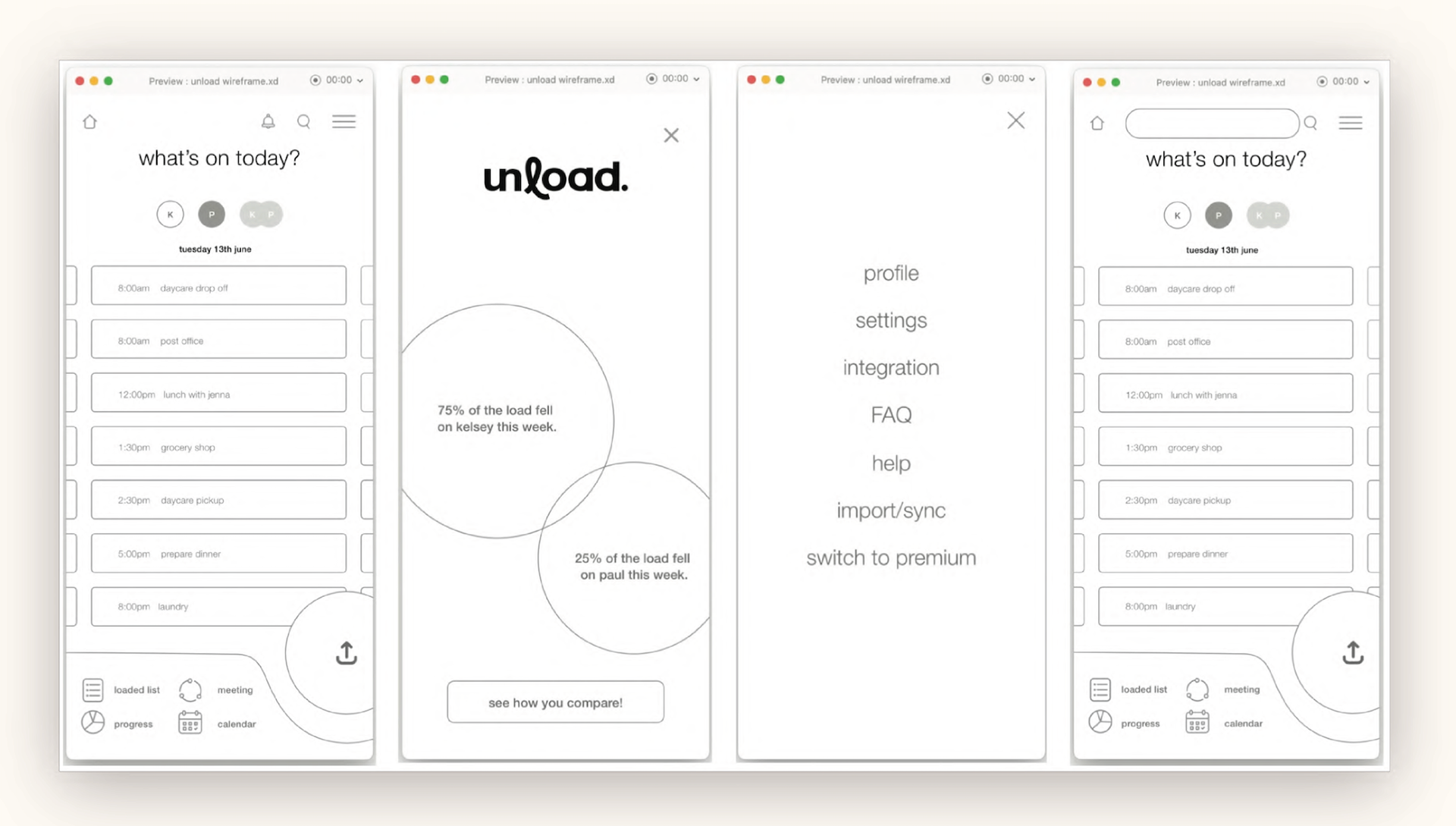
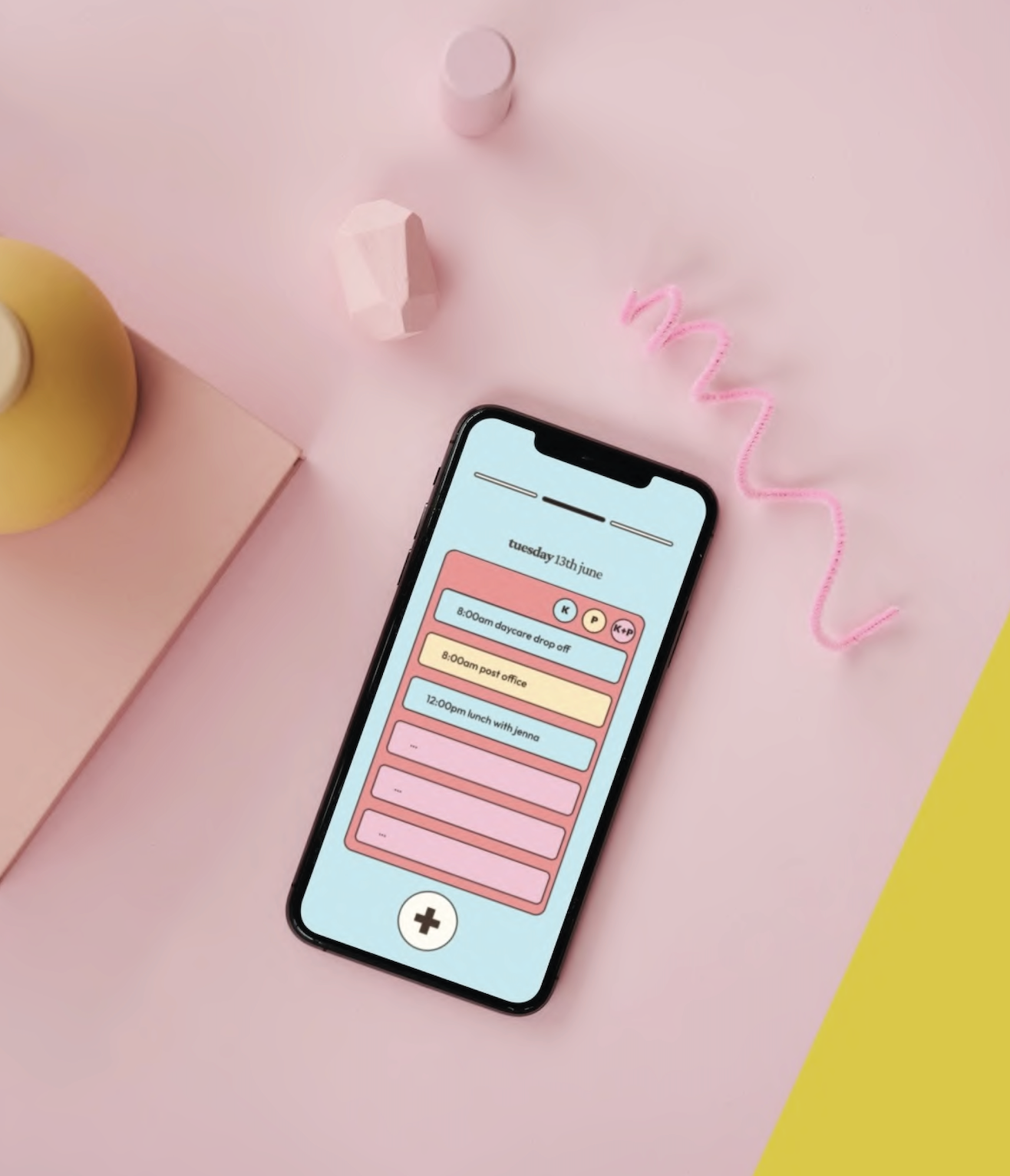
High Fidelity Wireframes
Created on Adobe XD
Key Learnings
Further developed websire to demonstrate brand identity - approachable, modern, friendly, and easygoing. Overall positive response to aesthetic of the site - maintained style
Navigation throughout app has been the biggest struggle for users -
clearer navigation created, scrolling/swiping of the dashboard included,
burger menu moved to the top where it is most commonly found so users
naturally return their attention there. Simulate the notification experience for users.
When allocated time or time is up, add an option to reschedule or
leave in loaded list for later for increased flexibility.
Future Updates
1. Use Al to suggest tasks that will contribute to the team goals.
2. Create an accessible set list of Favourite or Recurring tasks.
3. Notify collaborators on urgent tasks.
4. Possible iPad/ tablet integration that could live on the fridge??
5. Include a signature branded animation to reward users for
completing a task.
2. Create an accessible set list of Favourite or Recurring tasks.
3. Notify collaborators on urgent tasks.
4. Possible iPad/ tablet integration that could live on the fridge??
5. Include a signature branded animation to reward users for
completing a task.
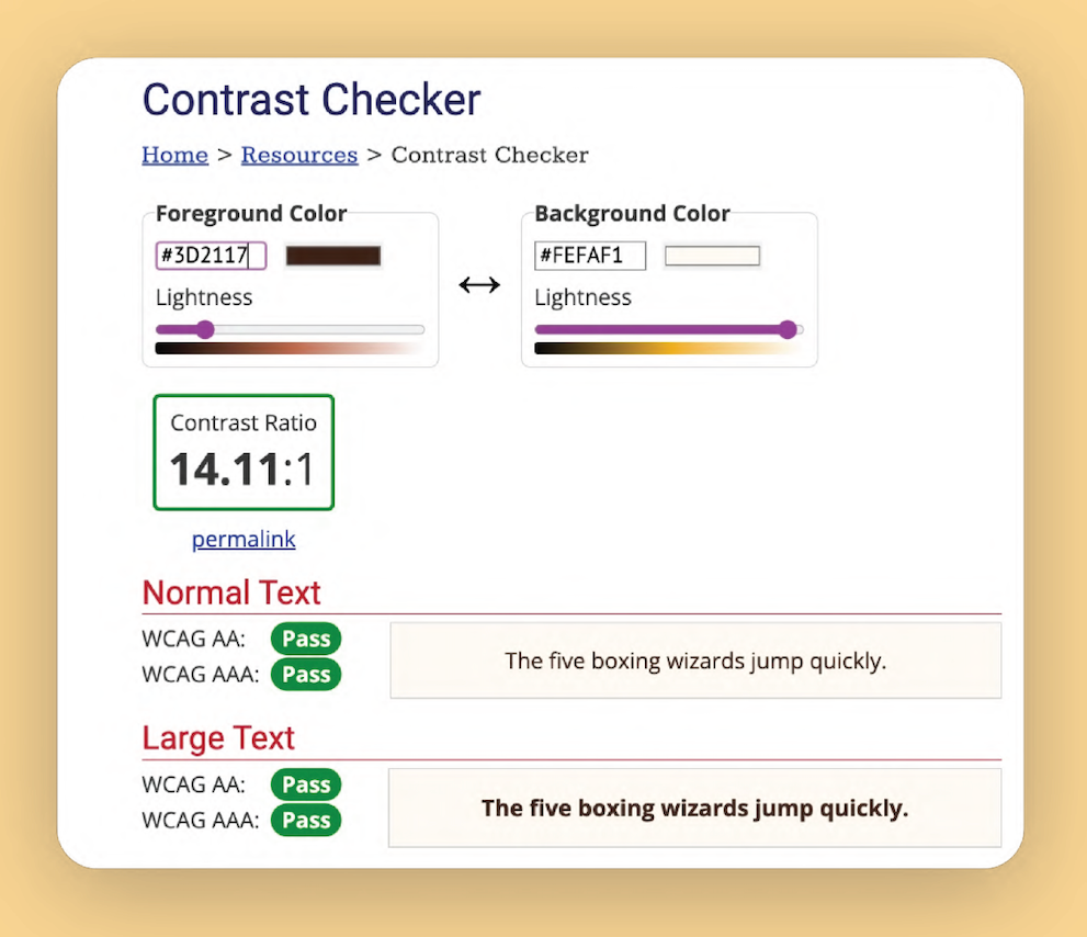
Guidelines + Compliance
Exploring web accessibility guidelines to create an
inclusive user experience.
inclusive user experience.
Our design will prioritise the provision of alternative text descriptions for images, ensuring
visually impaired users can comprehend visual content through screen readers.
visually impaired users can comprehend visual content through screen readers.
Additionally, closed captions and transcripts for multimedia elements, such as the
onboarding animation, will be included to enable users with hearing impairments to fully
engage with the app.
Unload will offer customisation options, allowing users to personalise and upload referential material for tasks, accommodating different needs and supporting diverse user
requirements.
We will focus on keyboard accessibility, enabling users with mobility impairments or
preferences for keyboard-based interactions to navigate and interact with the app using
only keyboard inputs. We will also provide alternatives to drag-and-drop mechanisms by
offering options to 'move to' tabs within the management system, ensuring operability for
all users.
To support users who require more time to process information or perform tasks, such as
those with cognitive disabilities, Unload incorporates minimal animations that increase
urgency in moderation as task deadlines approach, reducing stress and pressure.
The use of clear and simple language throughout the app's interface, avoiding jargon and
providing concise instructions and labels for better understanding. We tried to implement
consistent and intuitive navigation patterns, and provide contextual help, including an
onboarding walkthrough, particularly for users who may be new to organisation
frameworks or certain functionalities.
providing concise instructions and labels for better understanding. We tried to implement
consistent and intuitive navigation patterns, and provide contextual help, including an
onboarding walkthrough, particularly for users who may be new to organisation
frameworks or certain functionalities.
We hope to ensure compatibility with user agents and assistive technologies by adhering to coding standards and leveraging software that promotes best practices.
Drawing guidance from Google Material Design principles, our interface utilises surface
and colour-based interactions and visual effects like translucency to provide context and
hierarchy.
Future updates of Unload will include compatibility with wearable and spatial devices,
further expanding accessibility and usability.