Rationale
Kombucha has lately been a large in popularity. This has been identified through its status as a “super-healthy-drink”. The decision to create another Kombucha brand is join the bandwagon of health drinks. How this brand will correlate towards being another super health drink is what I will share.
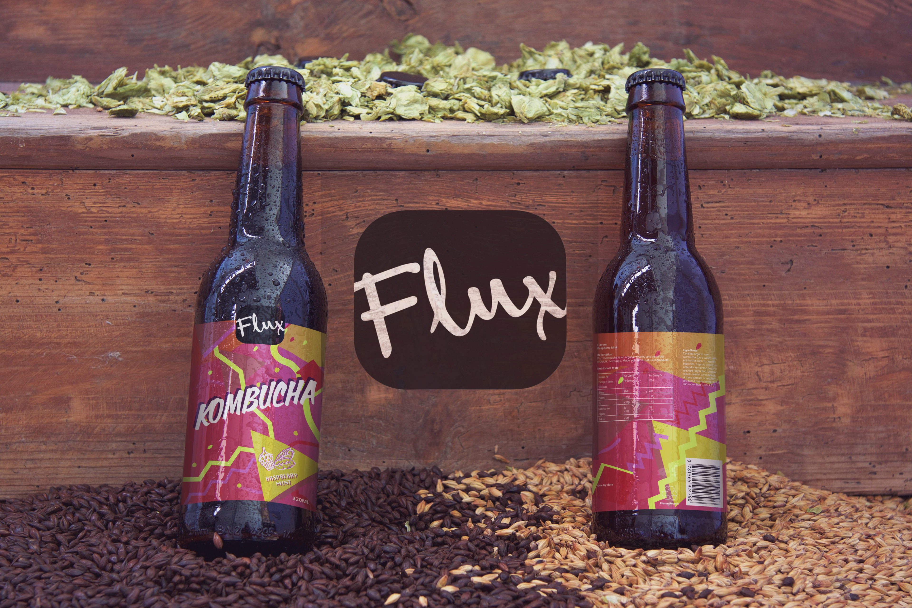
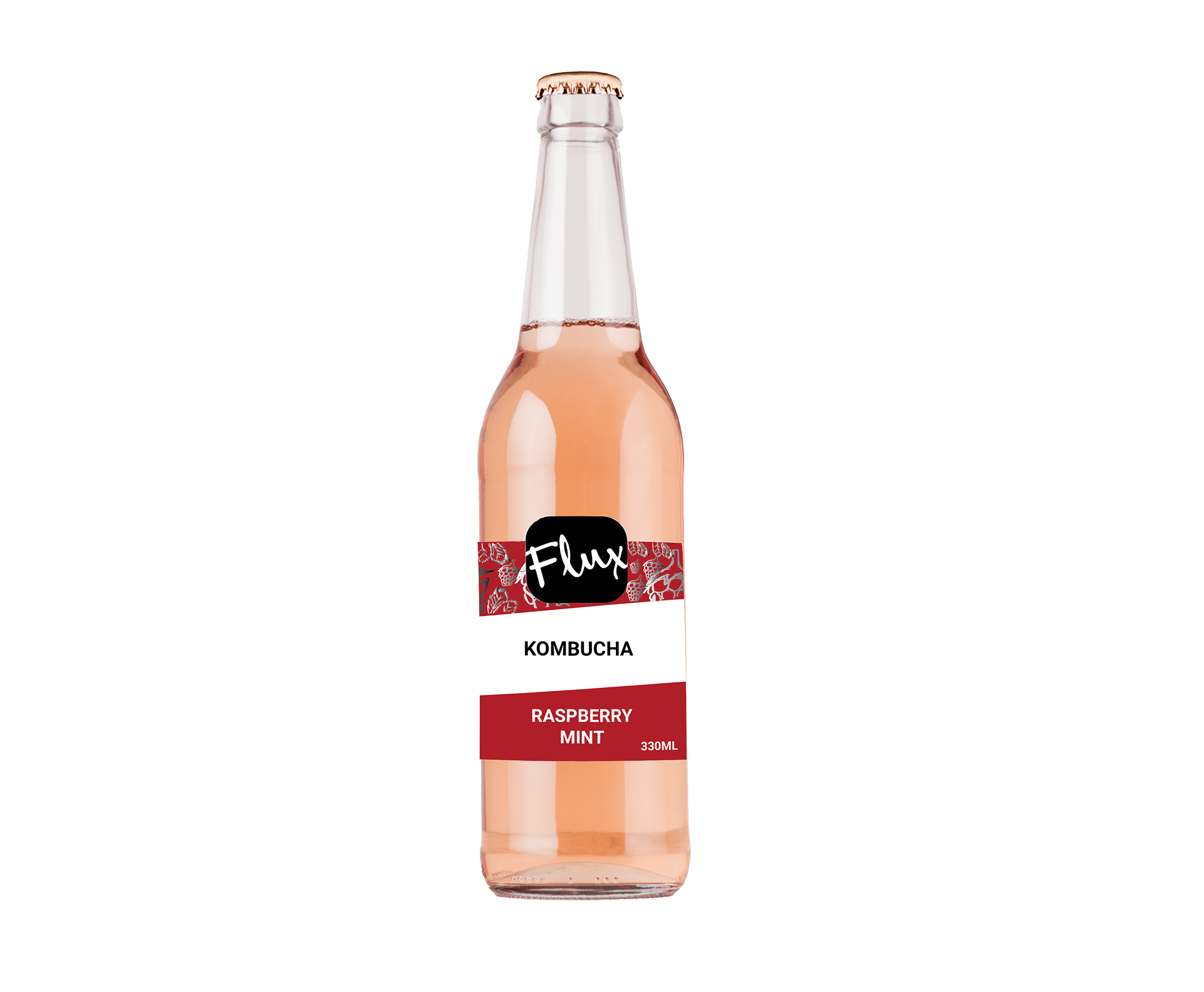
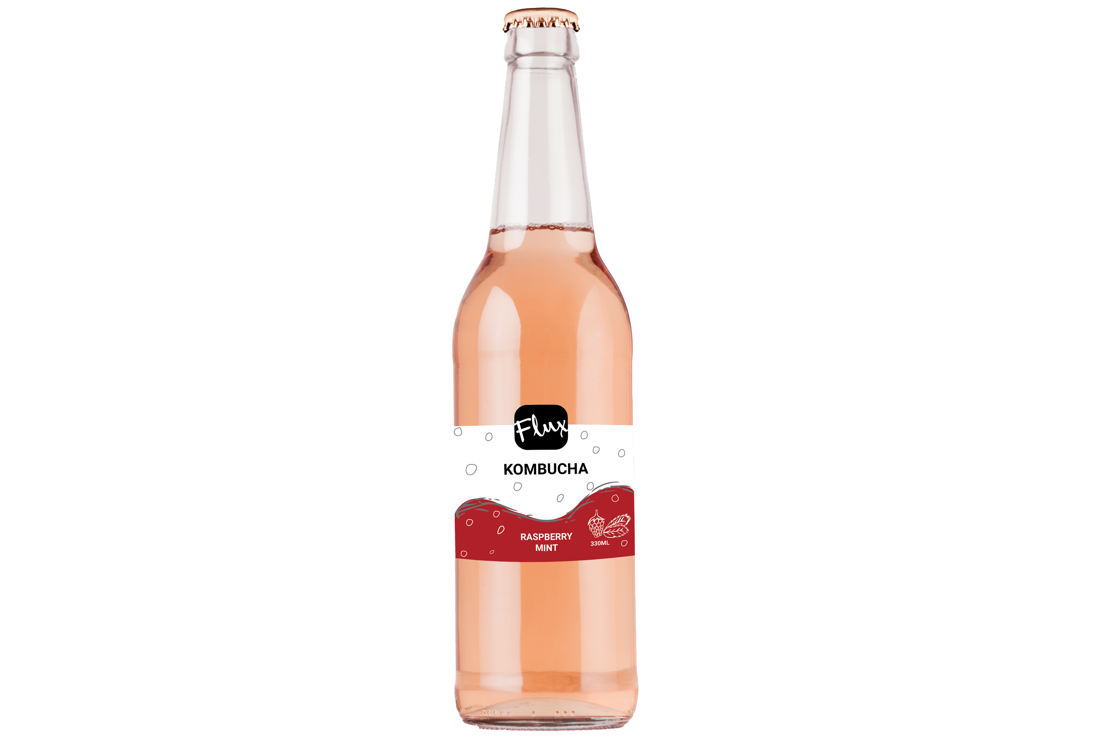
The composition of the brands dark crimson red creates intrigue among buyers. The energetic flavour it present would hope to impress the customer to purchase the product and thus enjoy consuming a health product. With the duel sided labels, one user can gaze upon the brands image of sale and important nutritional information.
The front label contains the eye gazing, energetic presentation of the Flux brand. The bubble circles emphasise the fizzyness of the drink to implement the brand as soda anyone would favour. Healthwise, it has potential to be an authentic substitute against consumption of unhealthy beverages notably Coca Cola. The black foil embellishment (when it has its physical embossing on the label) sparks a symbol of quality, pride and sophistication towards the customer. Mirrored from alcoholic labels, the embellishments inspire intrigue and interest, an essential sale point to lead the consumer to drink the product. Moreover, the white negative space is to raise simplicity of the product with the text and embellishment to lead in the point of salience of presentation. Lastely, the text is intentionally portrayed as bold to be loud and communicate towards the customer. The sizing grants itself to speak itself out surrounding the other elements in the front label.
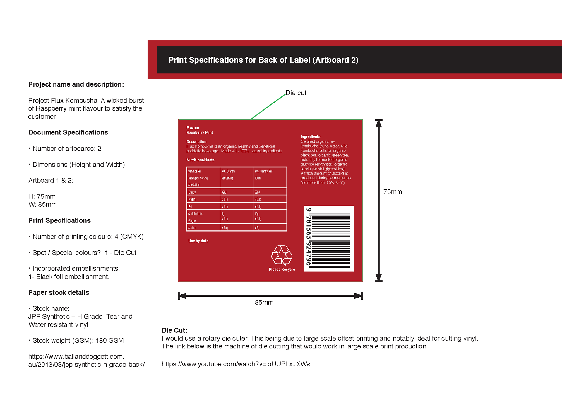
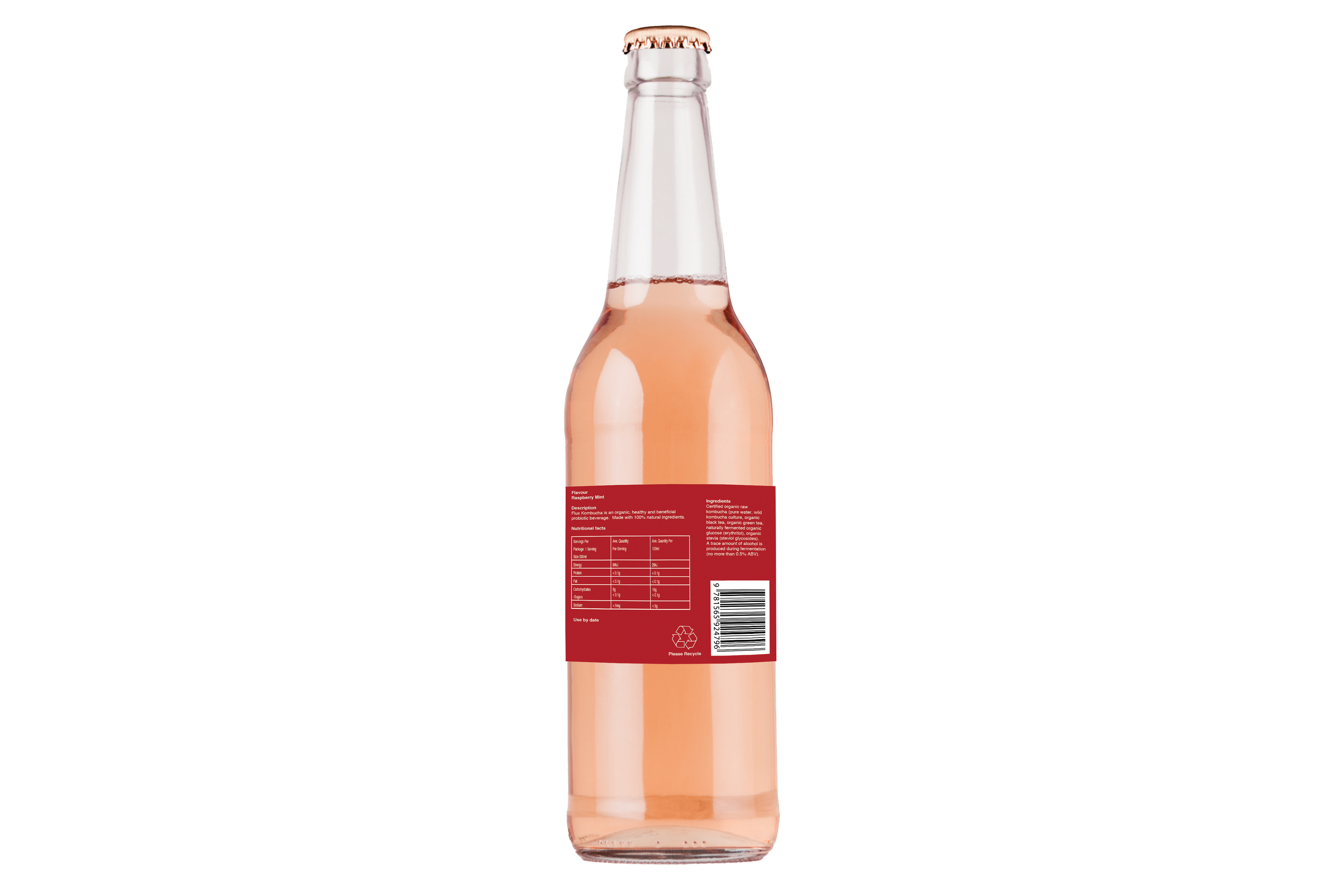
The back label is set up precisely for top quality assurance of nutritional output. The white writing of the famed Helvetica contrasts enough against the dark crimson red for perfect text portrayal and layout for any reader. All essentials are there! The product information, the cherished recycling logo, use by date for your own safety and ingredients. In addition, the layout is presented simple yet subtly imputed to remain consistent with the front of the label.
One day I'll have an actual Kombucha bottle.
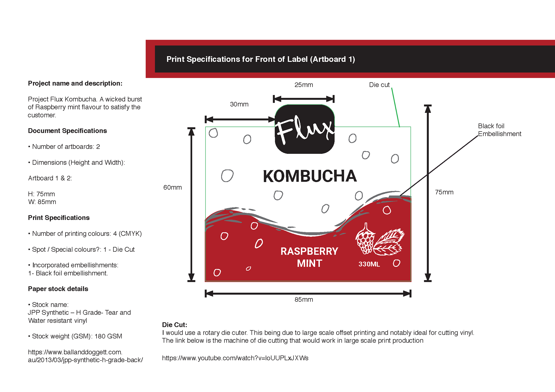
Print Ready Label 1
Print Ready Label 2
Print Specifications
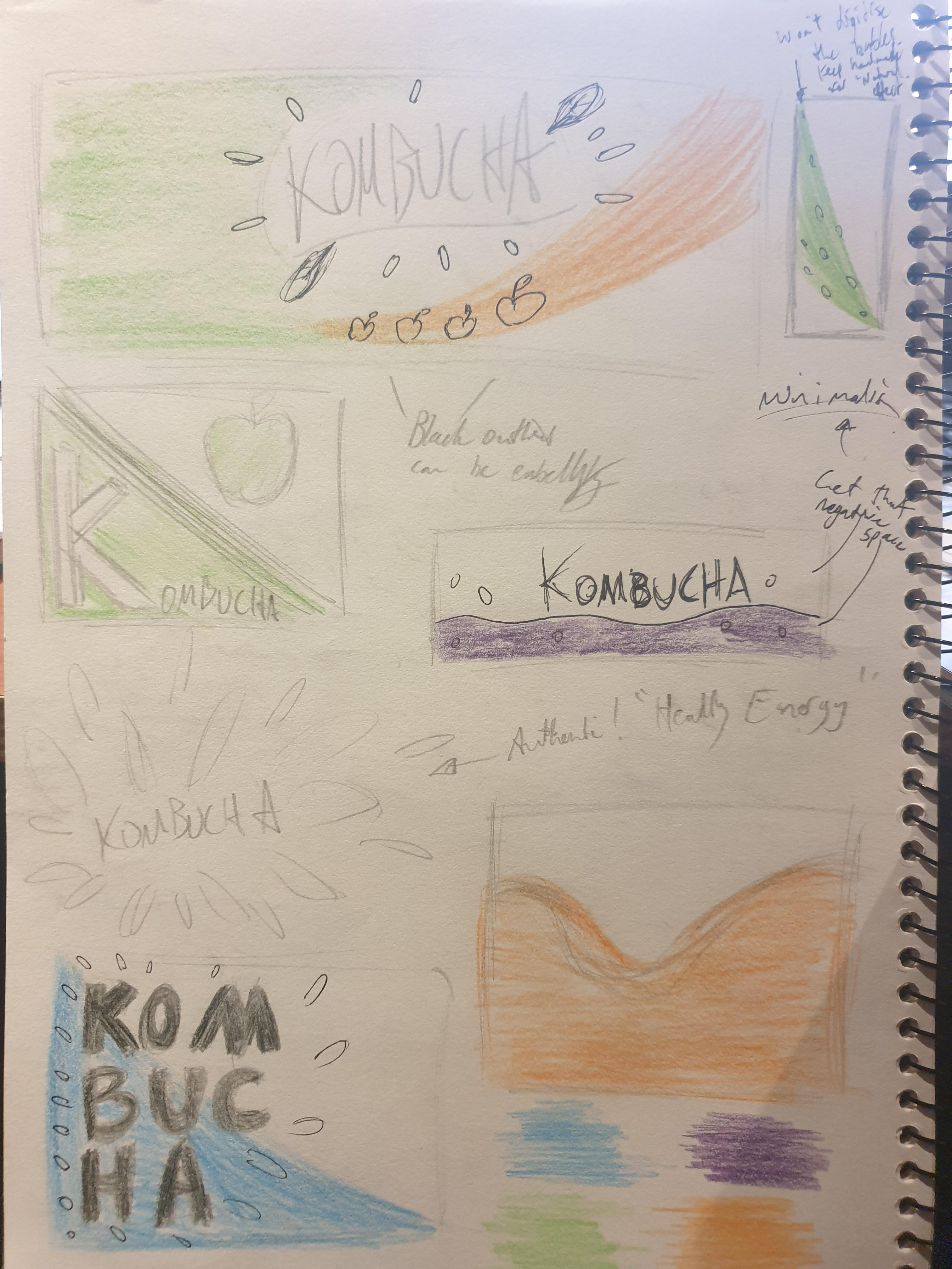
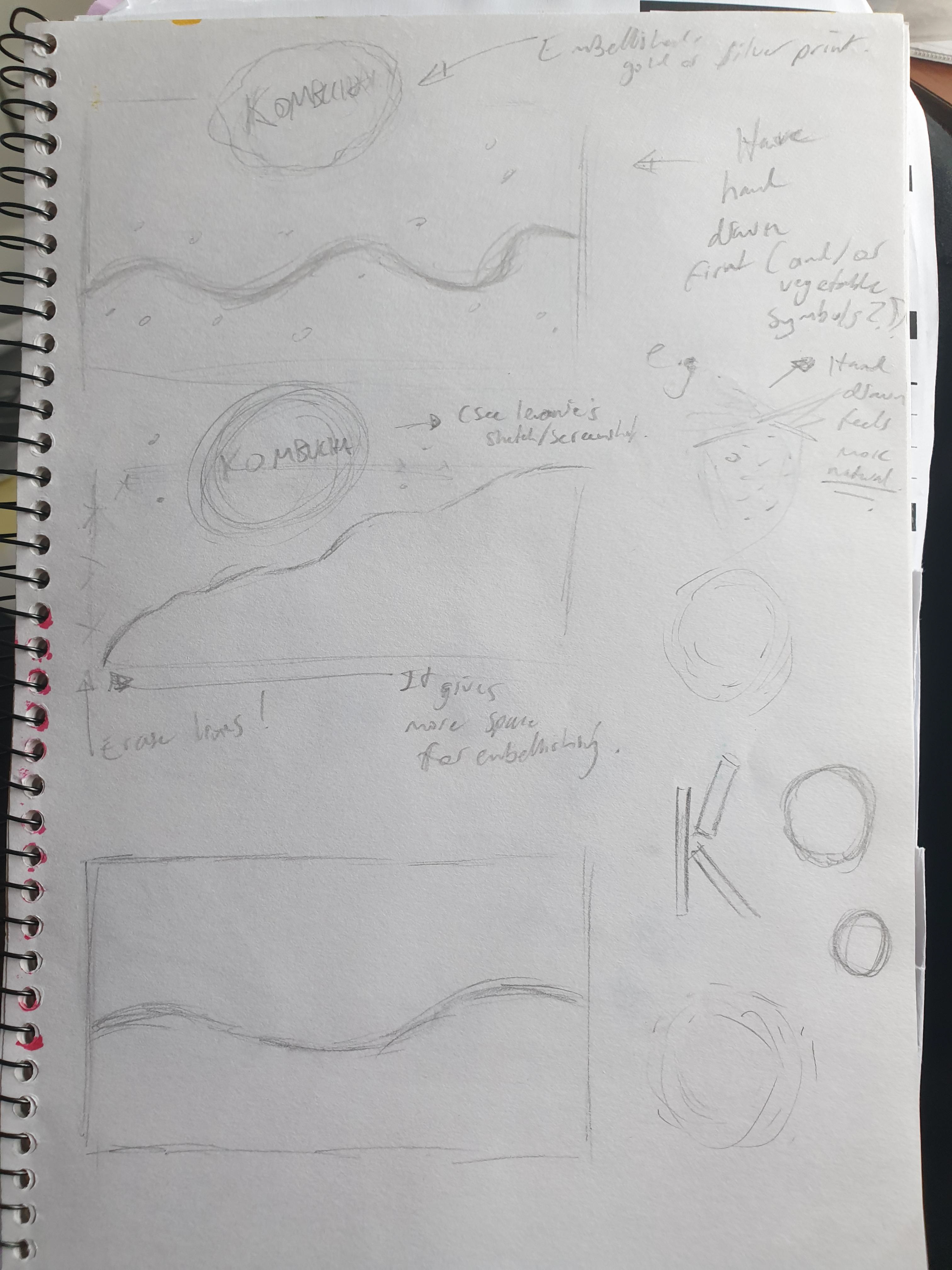
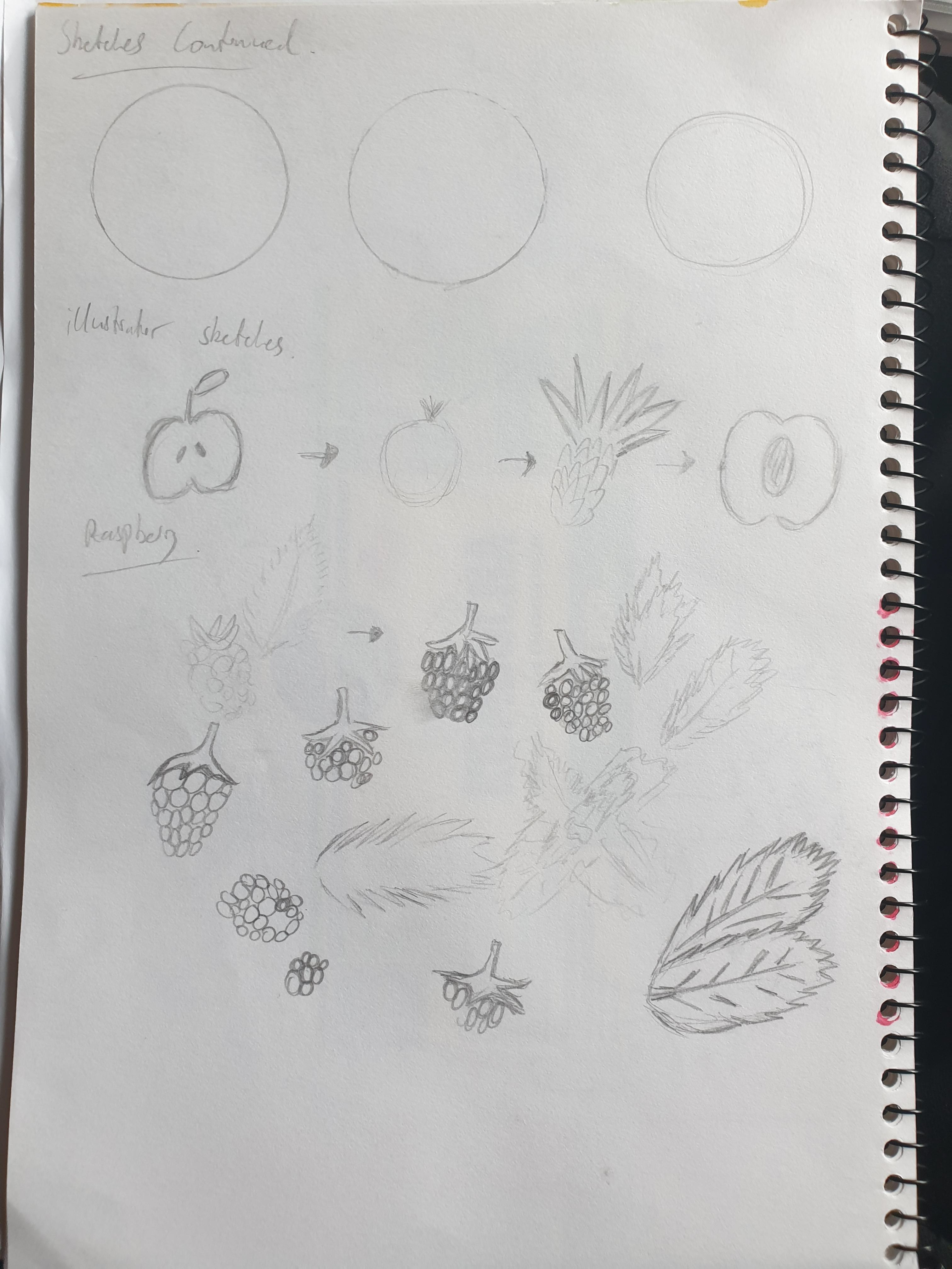
Developments
With a Kombucha sticker cut out, I was able to identify the measurements. I’ve also found it a lot easier to draw out ideas and work out another idea for designing the next Kombucha brand.
The colour symbolism is notably very simple. It's ideal to ensure the consumer is aware of the products properties such as being readable, and the correct choice of colour to distinguish flavour.
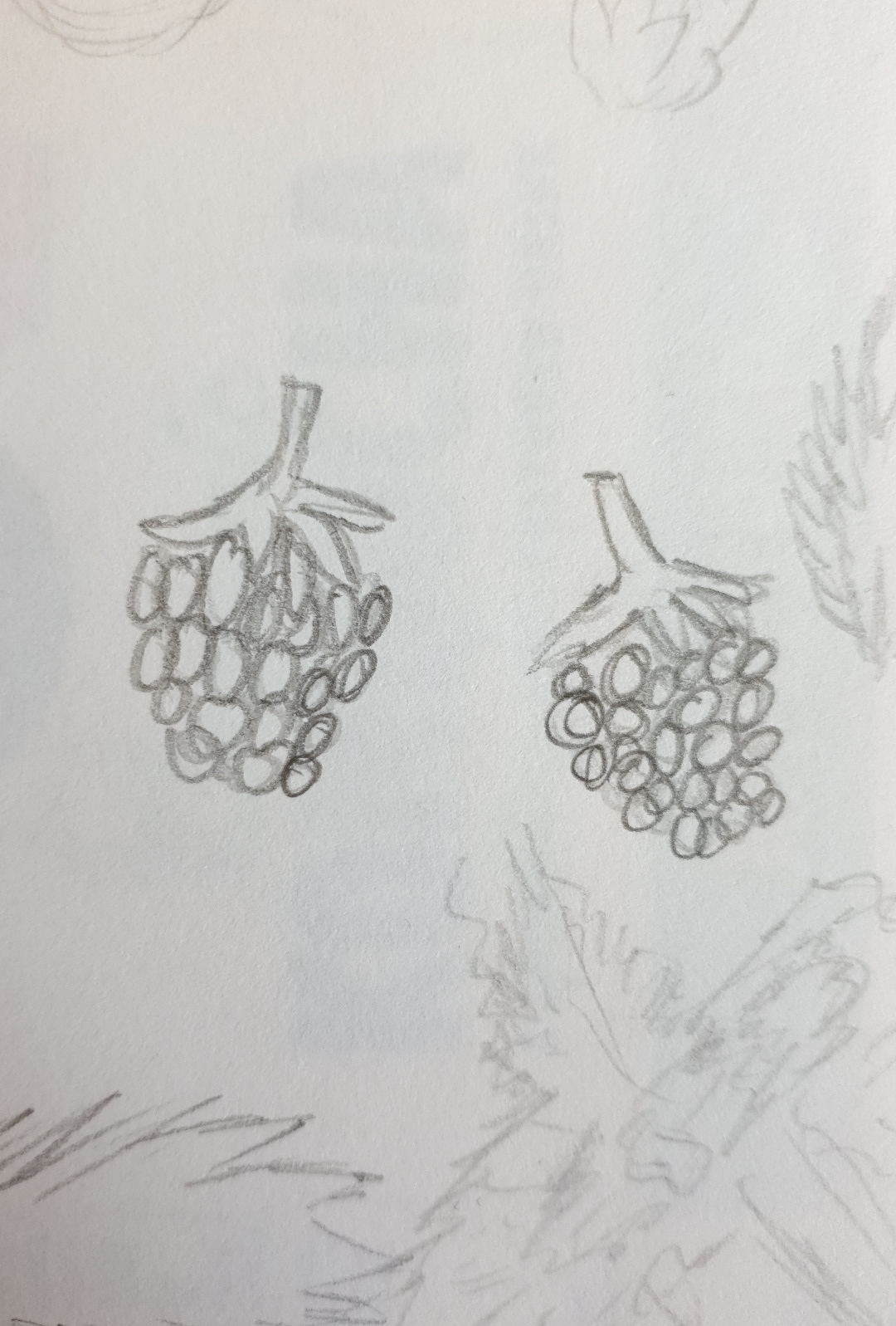
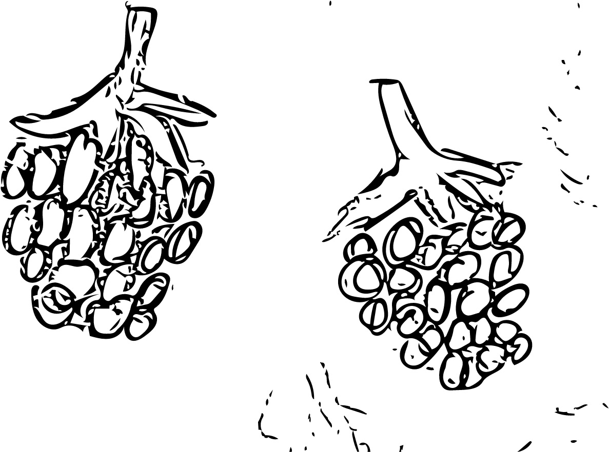
Before reading, you could assume the flavour is likely, apple, pear, kiwi or mint flavoured.
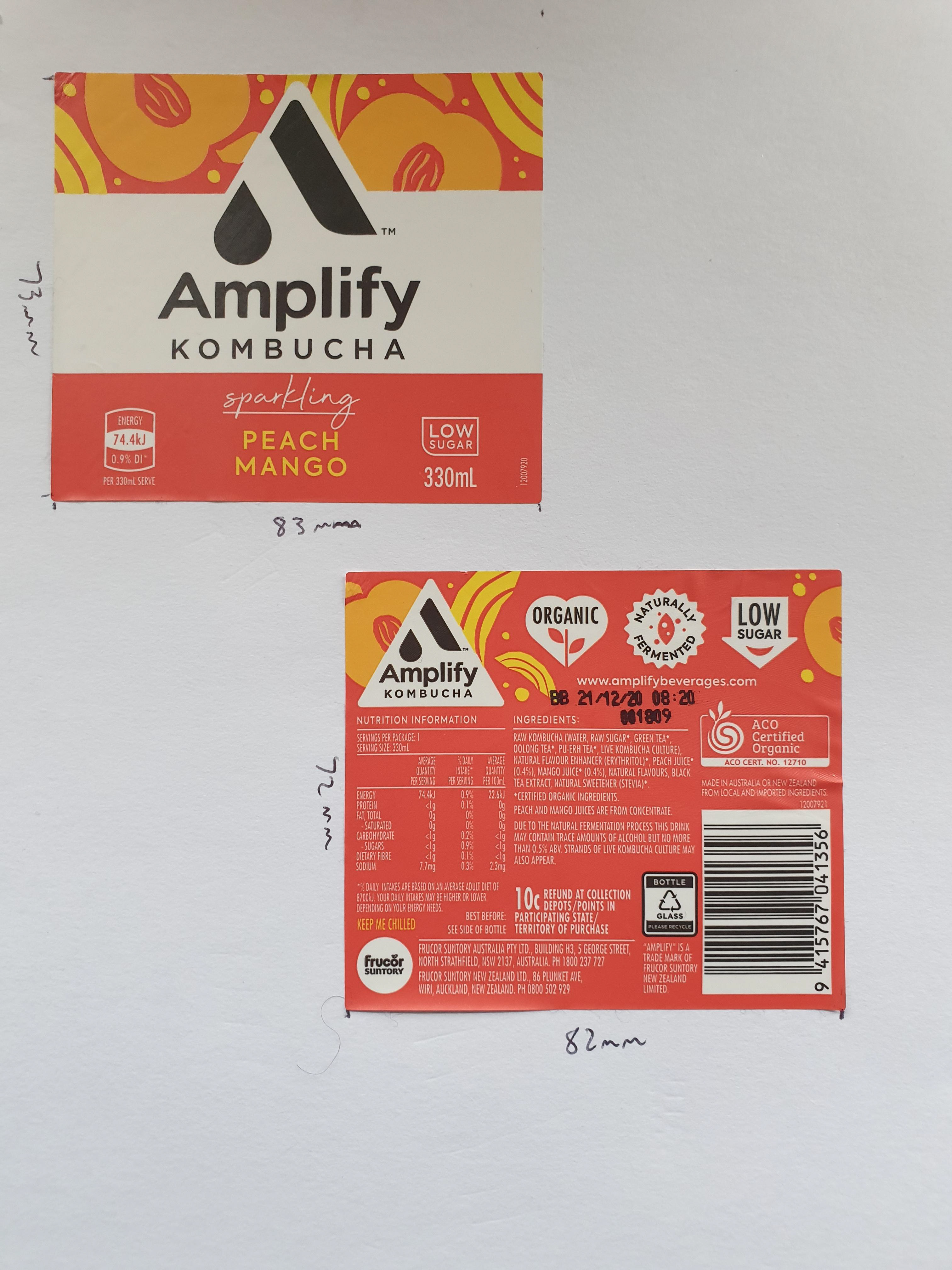
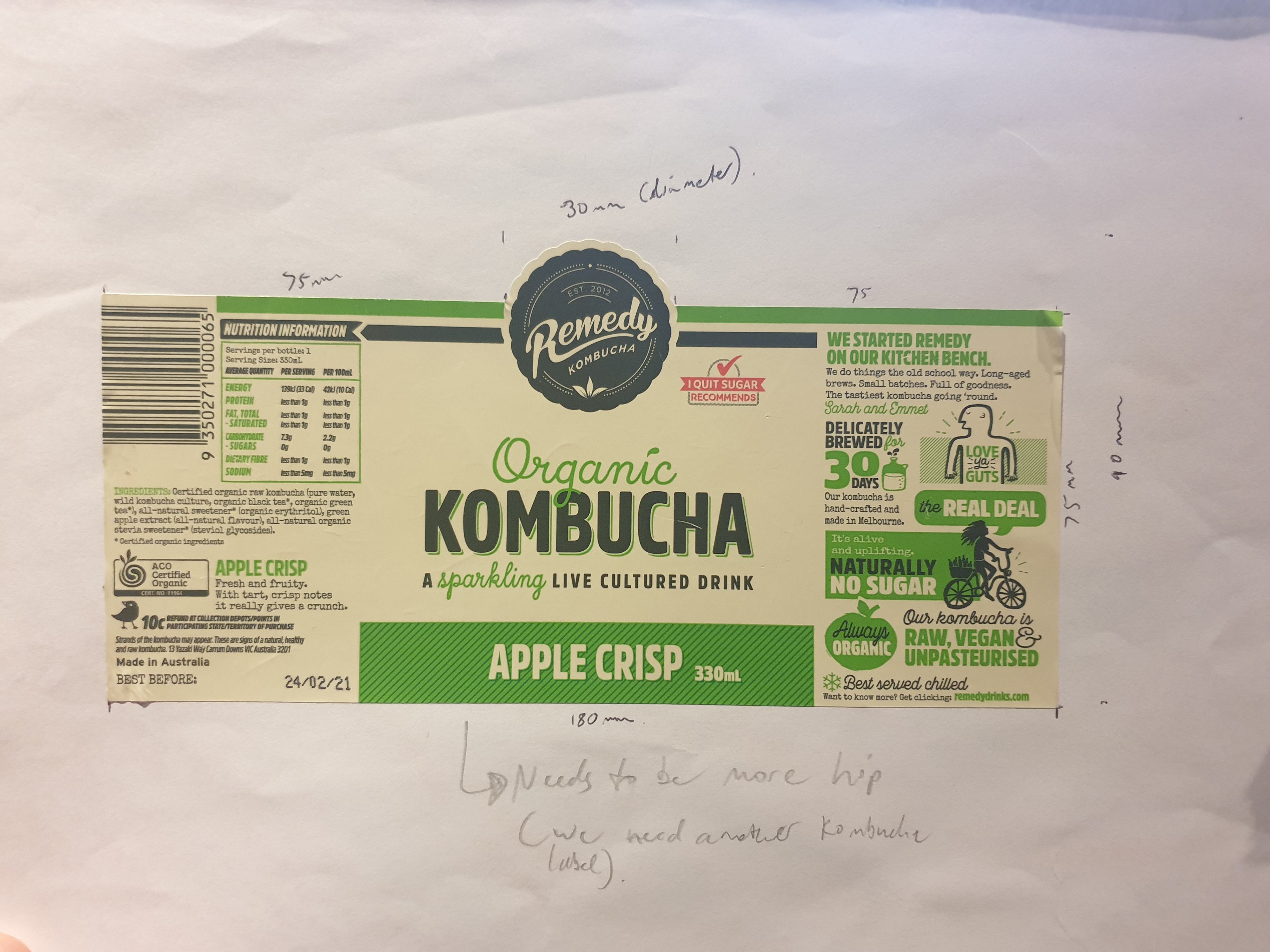
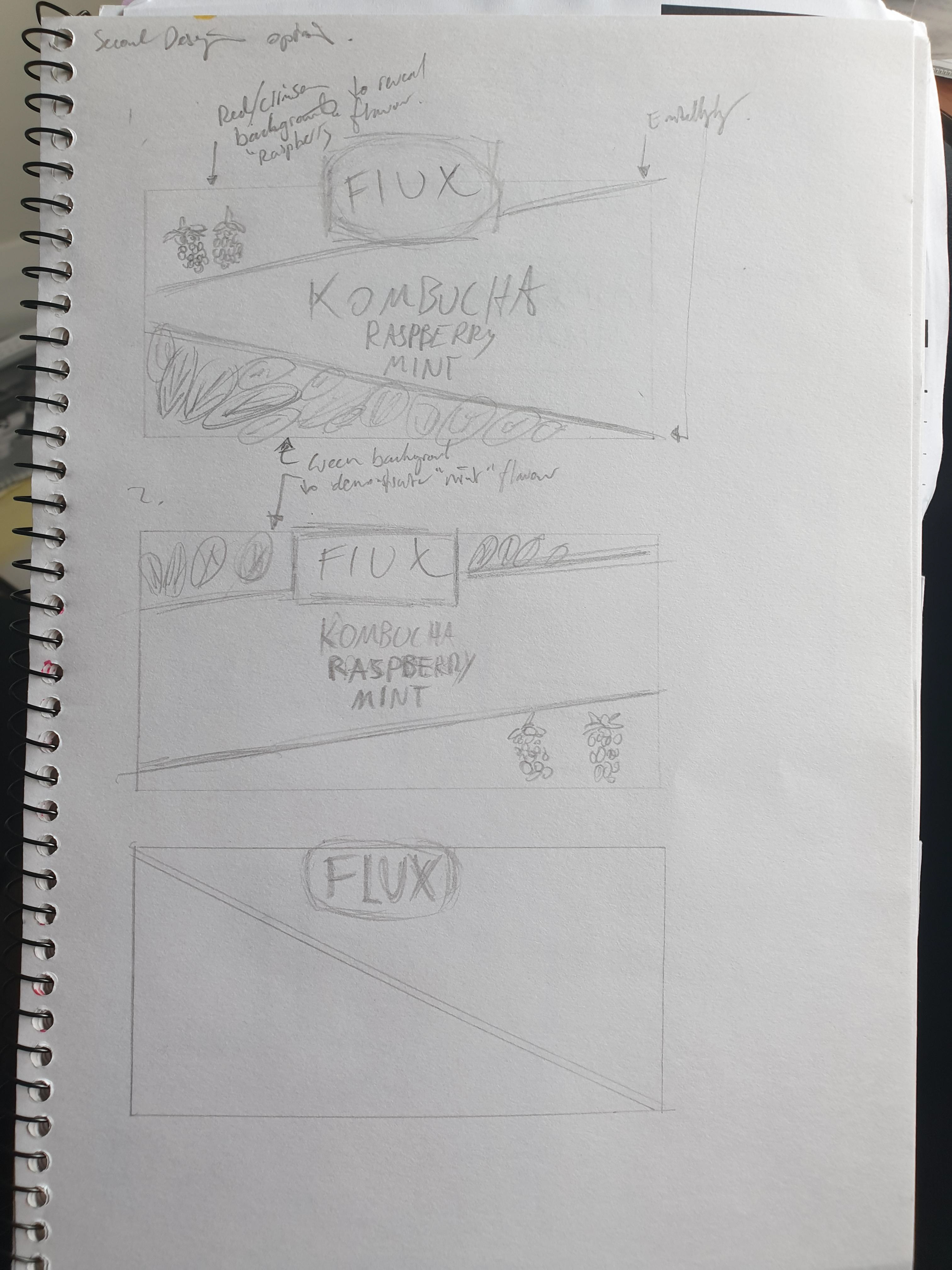
I once again researched the bottle labels to determine the printed form. After receiving the “Kombucha label text”, I realised that a single label would not work.
If using one label (as seen in the image above) there needs to be a balance. Note the nutritional information on the left and “kombucha information” on the right. This layout would have to be consistent in my own design label making. Working out the balance to have sorted on the left and right side would be difficult and time consuming.
You also cannot have the main section of the label on left side and the “kombucha information” on the right side. This is because when printed, the gap between the two vinyl ends will have to be the front of the bottle being to contain an unaesthetic layout.
As such, I split the labels in two to ensure the centering of the Flux logo, title of the label and additional elements. I bought another Kombucha bottle with two labels on their bottle to ensure that this decision would be fruitful of a label design.
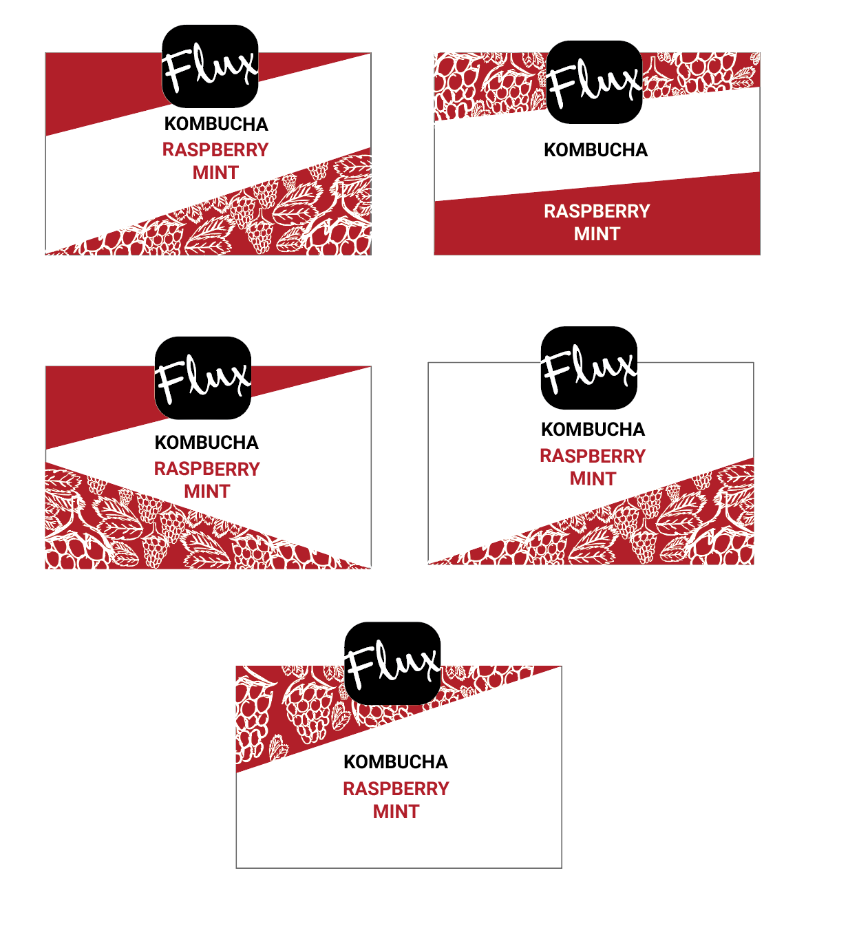
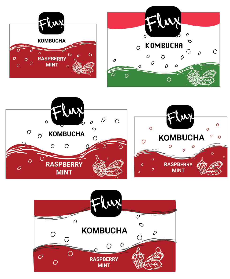
Mock Ups- Concept Ideas
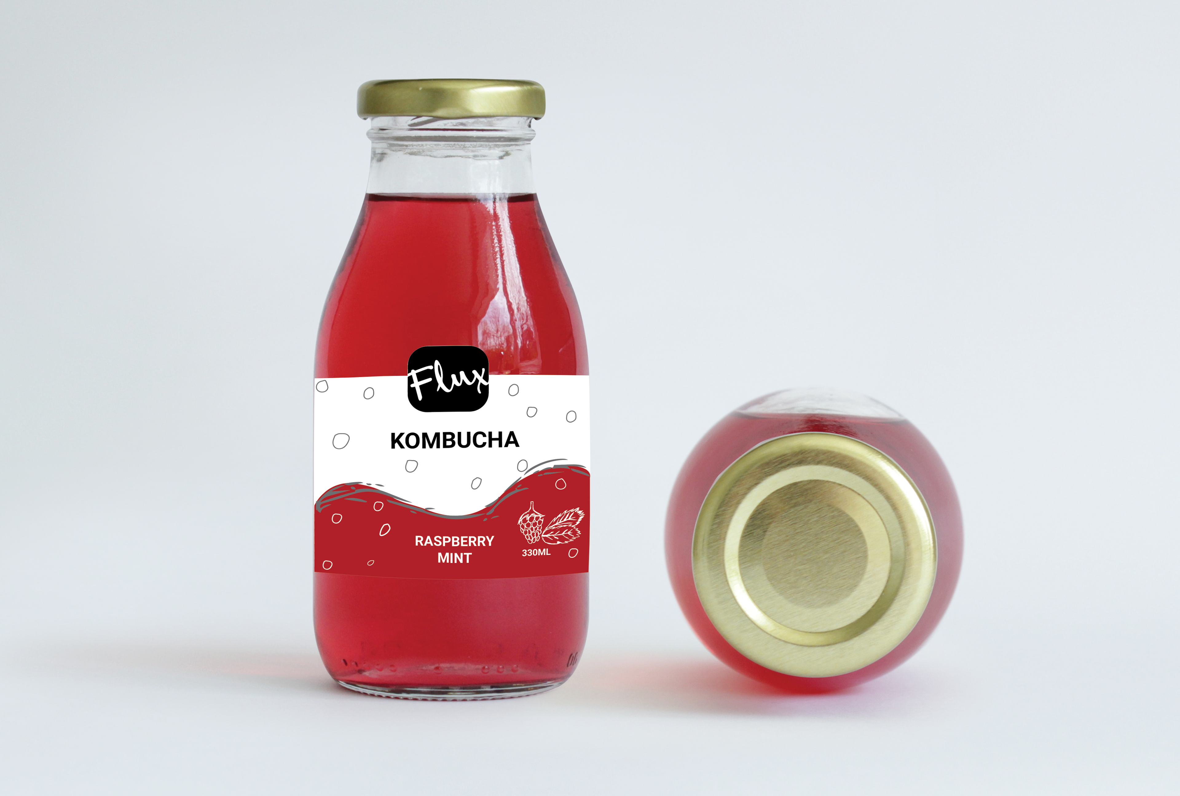
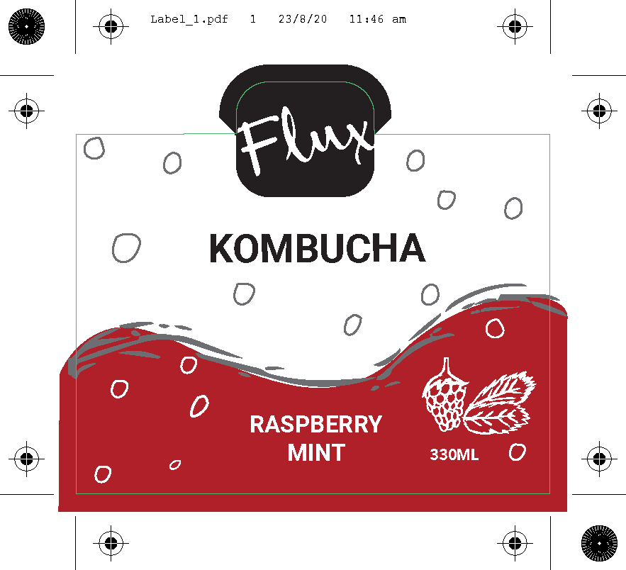
The consumer would see this label at first glance. The red liquid combined with the carefully selected colour palette provides a visual representation of a raspberry flavour towards the customer. The flux logo in clear viewing also successfully advertises the brand and if the consumer is satisfied, it thus raises the prestige of Flux amongst its competitor Kombucha brands.

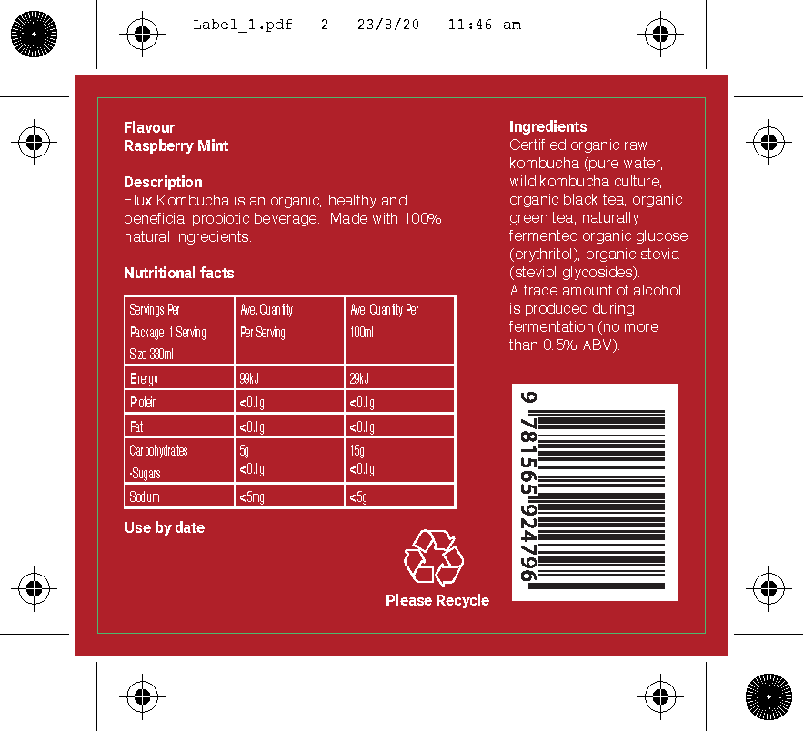
The nutritional information is perfectly laid out in print. Kept in small font to not ‘distract’ the user of an “information-overload”, the information lists all required info for the brand.
Typed in white, it contrasts against the red to be easily readable . The barcode, too, is also very clear to avoid any issues with any scanner.
Not only this, but the implementation of the recycling logo also demonstrates the brands affiliation towards the environment.
Testing out both the front and back on the bottles.
Same effect as the mock up above, with one label on the front advertising the brand and the label on the back being the necessary nutritional information.
The youtube video link below provides the printing process of the second label.
https://www.youtube.com/watch?v=rwEqJ4vgc1c
The youtube video link below provides the applying of the first label onto the bottle (long video, recommended to fast forward or speed up).
https://www.youtube.com/watch?v=ZIzKEbJrtFs
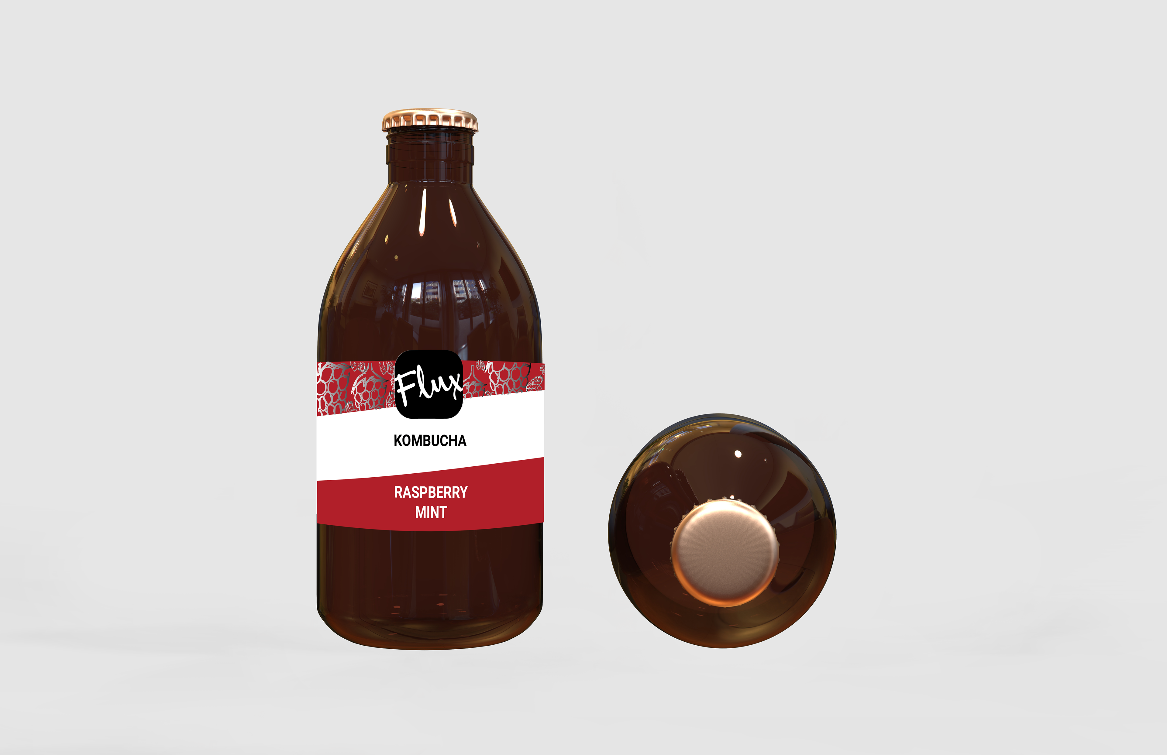
I know a mate of mine who has access to a vinyl printer. So I decided to print a prototype of the mock up brand.
Until I switched to the first label, I filmed the second one being printed. The aim was to identify the differences between the digital PDF output (when our work is print ready) and printed output.
I got it printed on with Mutoh xpj-1682sr. Printed on a Avery MP 3000 vinyl. I wasn’t able to print on the most desired vinyl as mentioned in my slides above. This mostly being due to cost, time and availability.
Test printing with a Mutoh xpj-1682sr
Testing applying the label.